
macaya brasil
macaya brasil
macaya is an inclusive brazilian bean-to-bar confectionery and education brand founded by Glaucer Roda. through “sabor & saber” the brand combines cacao-based sweets designed for different dietary needs with learning experiences that make technical food knowledge accessible and practical.
developed during ESPM’s Empowering Women Globally Program, this project repositioned Glaucer’s original business (Domremy Artesaria) into macaya. we led the full rebrand—strategy and positioning, naming, and brand architecture (macaya sabor/macaya saber), then built the system to scale: a modular visual identity, packaging system, and social media foundations. beyond design, we supported the business model and revenue logic, and delivered an investor-ready presentation to help macaya communicate its value and growth plan clearly.
year
2025
2025
duration
6 months
6 months
my role
led naming, visual identity system, and packaging (design + dielines + 3d), and produced social templates, brandbook, and presentation.
led naming, visual identity system, and packaging (design + dielines + 3d), and produced social templates, brandbook, and presentation.
team contribution
Lucy Moreira, Lys Razel, Pietra Lacerda, Yasmin Gomes — outreach and growth toolkit (sales, suppliers, investor narrative) + social support.
Lucy Moreira, Lys Razel, Pietra Lacerda, Yasmin Gomes — outreach and growth toolkit (sales, suppliers, investor narrative) + social support.
01
/challenge
challenge
challenge
the brand began as Domremy Artesaria, but the name and identity were creating friction instead of recognition: the naming mixed foreign references (including “artesanía”), was difficult to pronounce and remember, and had low digital findability and weak semantic clarity for a brand grounded in brazilian ingredients and ancestry. visually, the logo was overloaded and hard to apply consistently across small formats, limiting usability for packaging and everyday communication. at a business level, the brand also needed to operate as one ecosystem with two clear offers—products and education—without fragmenting the story, while shifting from passive communication toward a structure that supports sales, partnerships, and future funding narratives.
the brand began as Domremy Artesaria, but the name and identity were creating friction instead of recognition: the naming mixed foreign references (including “artesanía”), was difficult to pronounce and remember, and had low digital findability and weak semantic clarity for a brand grounded in brazilian ingredients and ancestry. visually, the logo was overloaded and hard to apply consistently across small formats, limiting usability for packaging and everyday communication. at a business level, the brand also needed to operate as one ecosystem with two clear offers—products and education—without fragmenting the story, while shifting from passive communication toward a structure that supports sales, partnerships, and future funding narratives.
outcome
outcome
we repositioned and renamed the brand as macaya, establishing a more ownable, culturally aligned identity designed for clear recall and consistent application. we defined the brand architecture around two complementary fronts—macaya sabor (products) and macaya saber (education)—so each offer can grow independently while sharing one coherent signature and set of rules. the system includes structured identity assets (core mark and symbol variations for each front, typography, color logic, and iconography) and governance through a brandbook that translates strategy into repeatable decisions across packaging and communication—reducing inconsistency, improving legibility in small applications, and enabling faster rollout of new products and educational formats.
we repositioned and renamed the brand as macaya, establishing a more ownable, culturally aligned identity designed for clear recall and consistent application. we defined the brand architecture around two complementary fronts—macaya sabor (products) and macaya saber (education)—so each offer can grow independently while sharing one coherent signature and set of rules. the system includes structured identity assets (core mark and symbol variations for each front, typography, color logic, and iconography) and governance through a brandbook that translates strategy into repeatable decisions across packaging and communication—reducing inconsistency, improving legibility in small applications, and enabling faster rollout of new products and educational formats.


02
/strategy
strategy
strategy
to unlock clarity and scale, we made one structural decision early: rename domremy artesaria and rebuild the brand architecture. the previous name limited recall and discoverability, so we developed a sound- and meaning-led name that could carry a clearer system. from there, we translated the brand’s purpose into one cohesive framework—positioning, verbal tone, visual identity, packaging, social templates, and guidelines—so every touchpoint could operate with the same logic and stay consistent as the business grows.
macaya was positioned as a chocolate-and-impact brand where affection is the emotional differentiator and origin is the proof. rather than framing the offer as “healthy sweets,” we anchored the brand at the intersection of technique and ancestry—where food becomes a language that can nourish, teach, and transform. this was structured through two connected fronts: macaya sabor (products and sensorial experience) and macaya saber (education and knowledge-sharing), designed to reinforce each other while staying immediately understandable.
impact was treated as part of desire—not as responsibility messaging. origin, producers, conservation, and traceability became elements of value people can see, feel, and share, from ingredient choice to packaging decisions. to make this tangible, we defined a sensorial direction (texture, form, color energy, and language) and a communication structure guided by four pillars—relationship, authority, inspiration, and conversion—supported by the founder’s voice as a credibility anchor, while keeping the tone warm, elegant, and accessible.
before

before
after
after
packaging

social media


03
/system
identity system
identity system
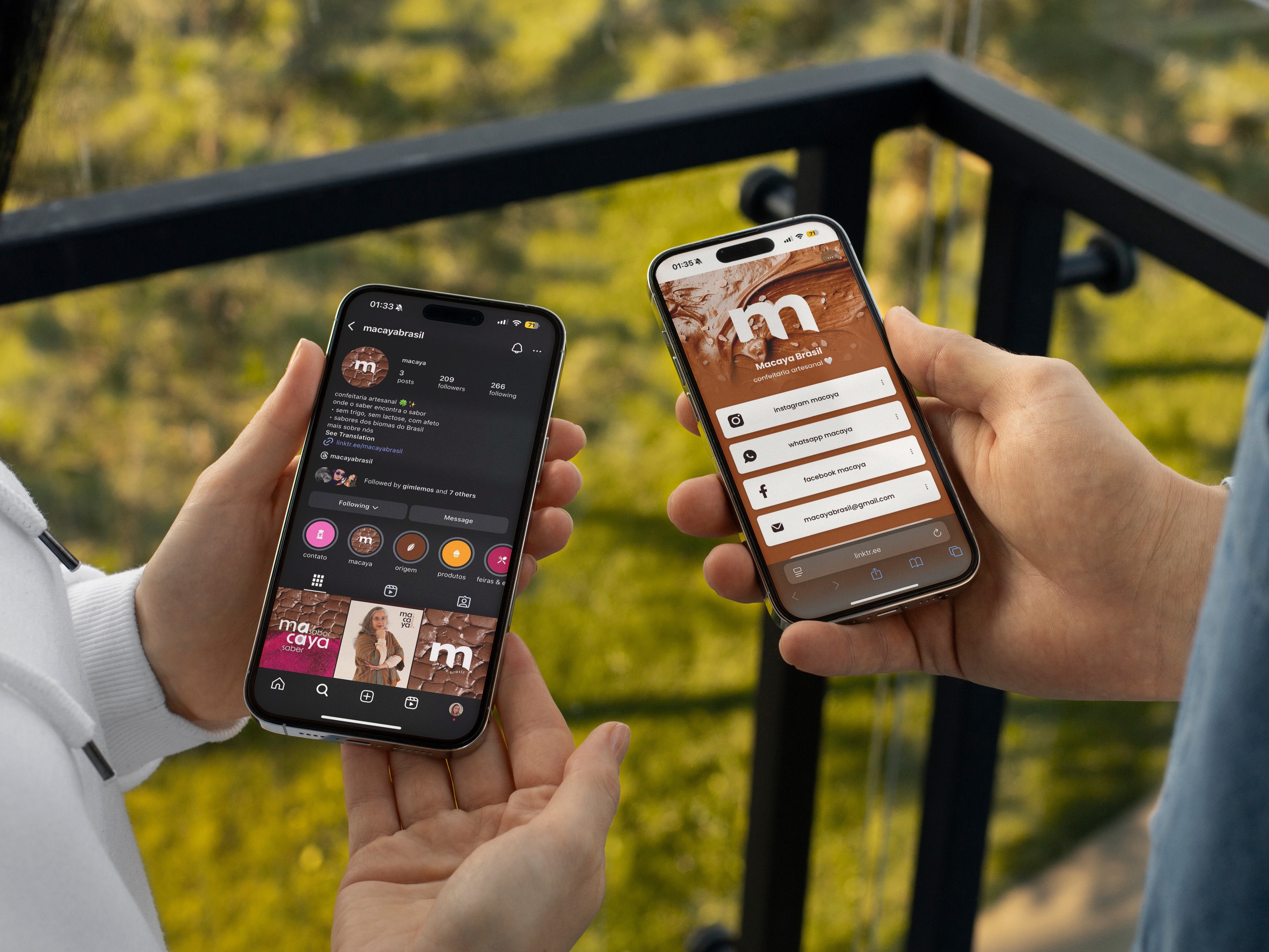
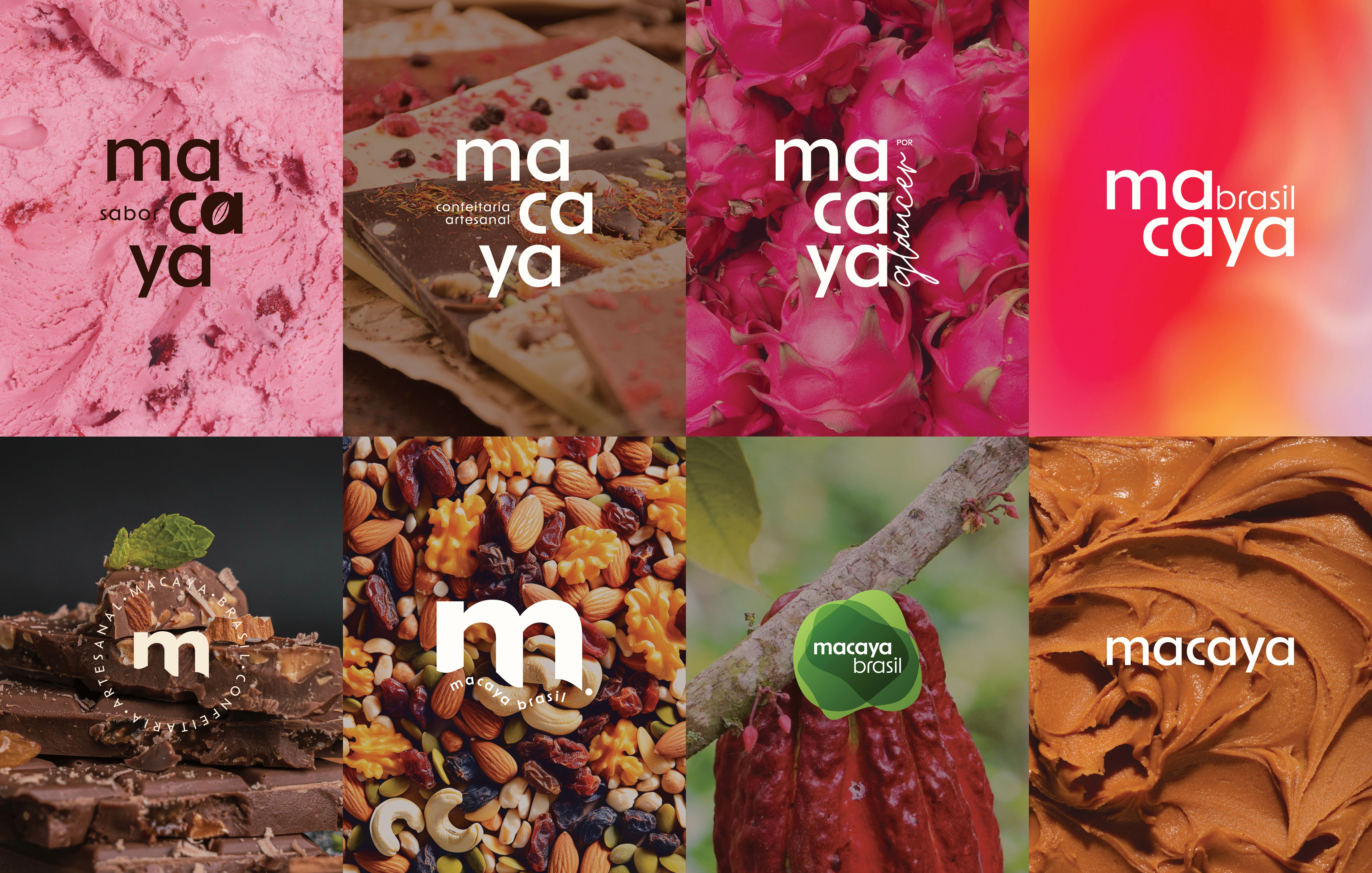
the identity system translates macaya’s positioning into a cohesive toolkit built for consistency across touchpoints. it holds one clear signature while organizing the ecosystem through two fronts—macaya sabor (products and sensorial experience) and macaya saber (education and knowledge-sharing)—so the brand remains easy to navigate and recognizable across formats.
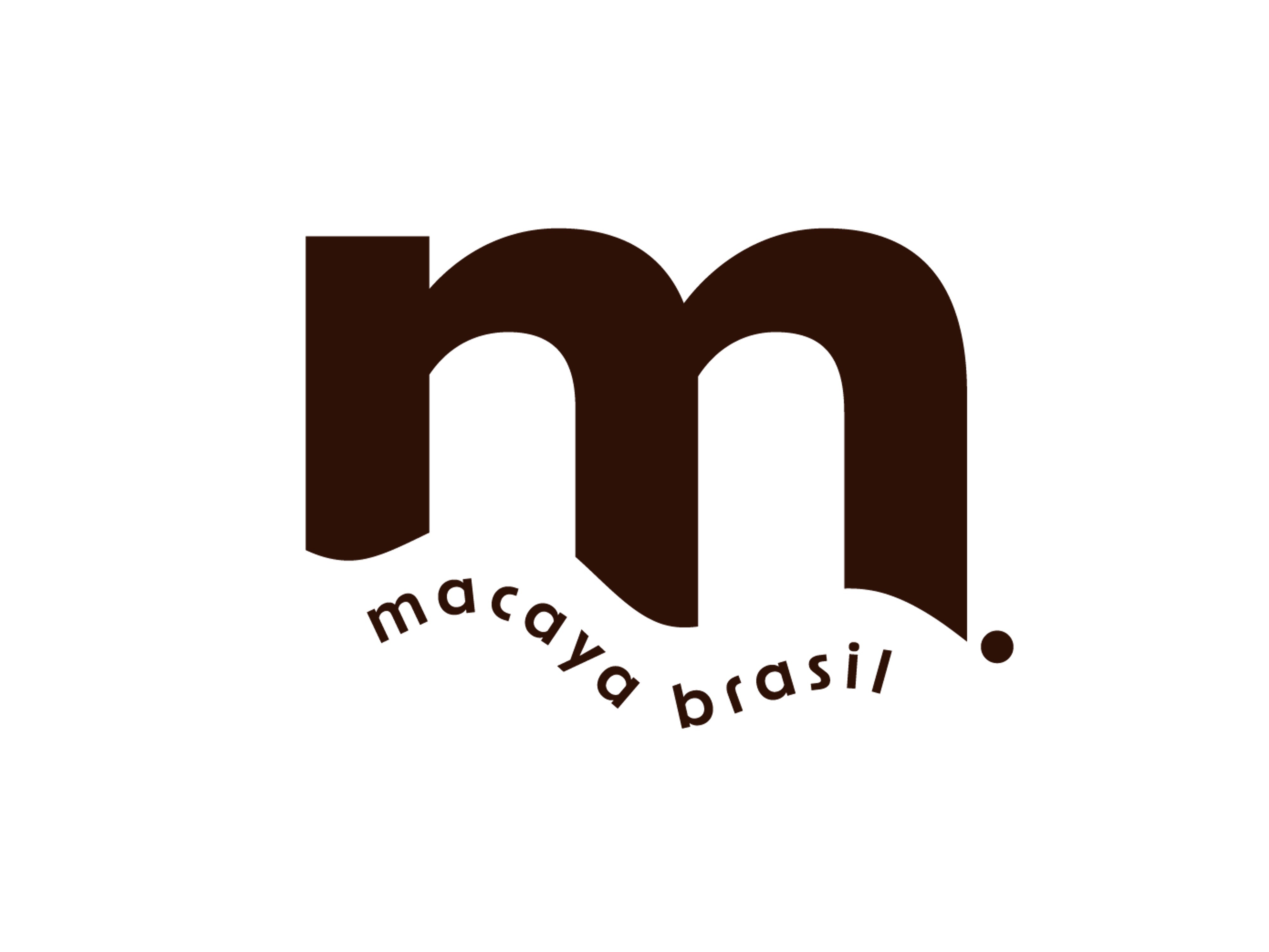
built as a modular system, it includes a complete mark family (primary logotype, responsive lockups, and a shorthand symbol), architecture signatures (macayabrasil, macaya sabor, macaya saber), and a structured typography approach anchored in a brazilian type choice—reinforcing brasilidade through authorship rather than stereotypes. color operates as a functional layer to support hierarchy and wayfinding, supported by an icon set for scanning and storytelling, plus textures, shapes, and image direction that build a sensorial world connected to cacao and nature.
the system extends into practical rules for packaging and digital communication—information hierarchy, layout rhythm, variation logic, dielines, and social templates (grid structure, post/story modules, and navigation assets)—supported by guidelines for consistent application over time. the result is a premium yet warm brand experience that stays coherent as it scales, while making the macaya ecosystem easy to understand at a glance.
the identity system translates macaya’s positioning into a cohesive toolkit built for consistency across touchpoints. it holds one clear signature while organizing the ecosystem through two fronts—macaya sabor (products and sensorial experience) and macaya saber (education and knowledge-sharing)—so the brand remains easy to navigate and recognizable across formats.
built as a modular system, it includes a complete mark family (primary logotype, responsive lockups, and a shorthand symbol), architecture signatures (macayabrasil, macaya sabor, macaya saber), and a structured typography approach anchored in a brazilian type choice—reinforcing brasilidade through authorship rather than stereotypes. color operates as a functional layer to support hierarchy and wayfinding, supported by an icon set for scanning and storytelling, plus textures, shapes, and image direction that build a sensorial world connected to cacao and nature.
the system extends into practical rules for packaging and digital communication—information hierarchy, layout rhythm, variation logic, dielines, and social templates (grid structure, post/story modules, and navigation assets)—supported by guidelines for consistent application over time. the result is a premium yet warm brand experience that stays coherent as it scales, while making the macaya ecosystem easy to understand at a glance.

mark development
mark development
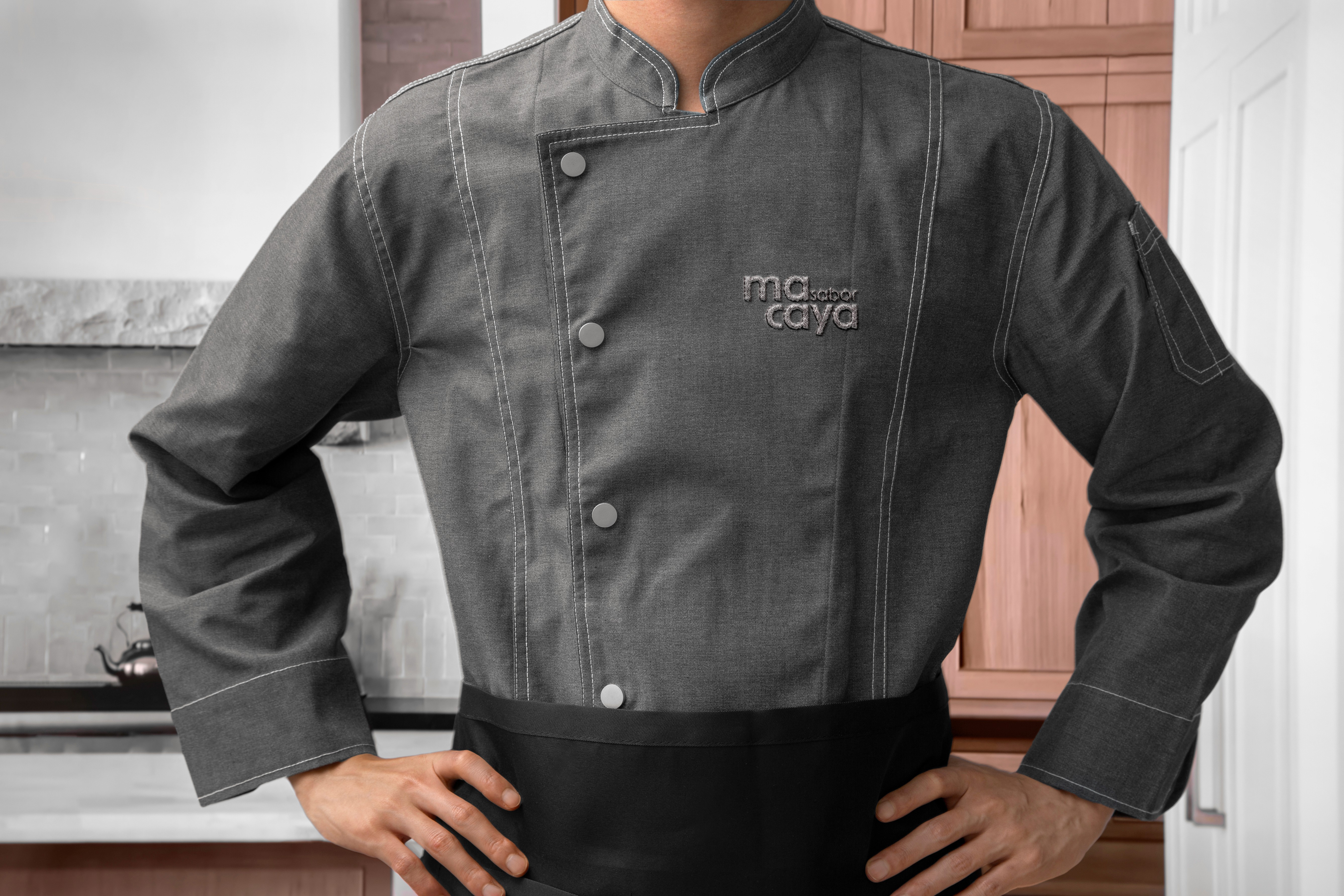
the macaya mark was designed as a responsive system—not a single fixed logo—so it performs consistently across packaging, digital touchpoints, and educational materials. starting from the brand architecture, we built a family of lockups that holds up under real constraints, from small avatars to complex packaging hierarchies and future extensions. the result is a contemporary typographic signature in lowercase, supported by modular variations that protect legibility, recognition, and clear labeling across macaya’s pillars.
the macaya mark was designed as a responsive system—not a single fixed logo—so it performs consistently across packaging, digital touchpoints, and educational materials. starting from the brand architecture, we built a family of lockups that holds up under real constraints, from small avatars to complex packaging hierarchies and future extensions. the result is a contemporary typographic signature in lowercase, supported by modular variations that protect legibility, recognition, and clear labeling across macaya’s pillars.

naming process
naming process
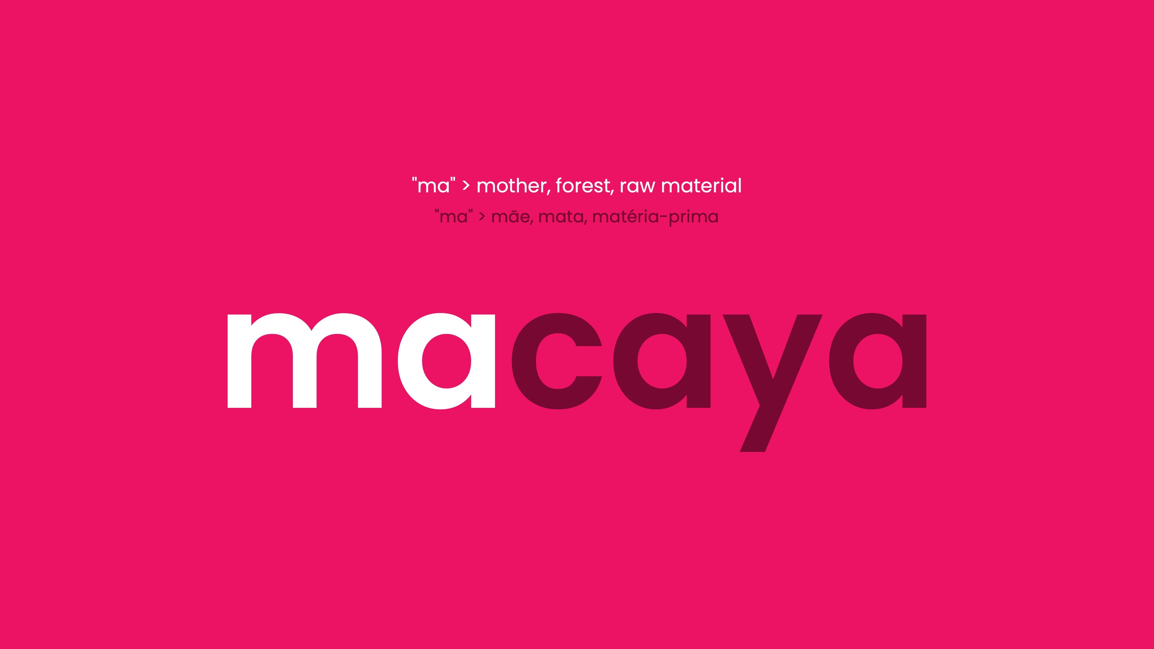
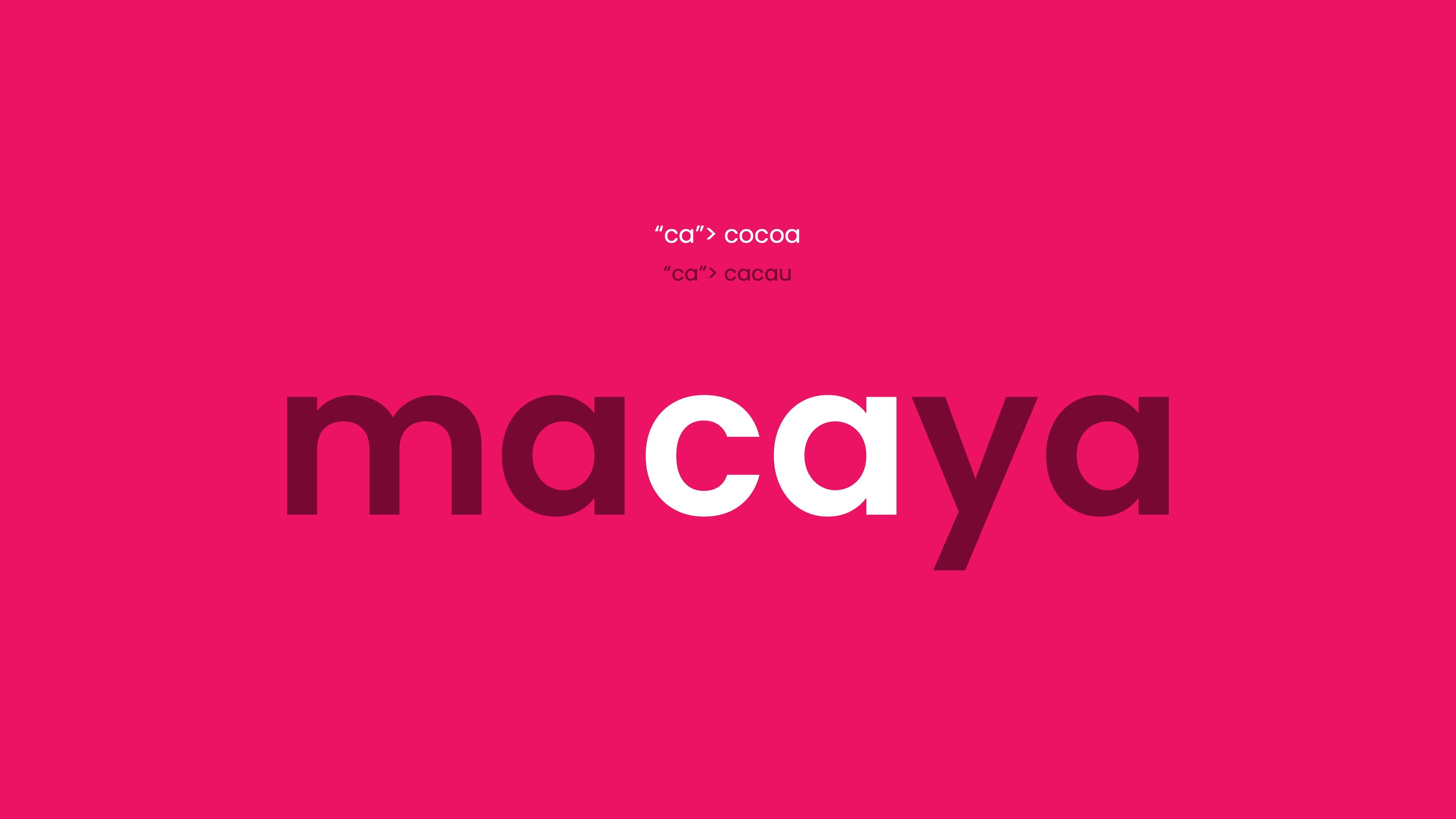
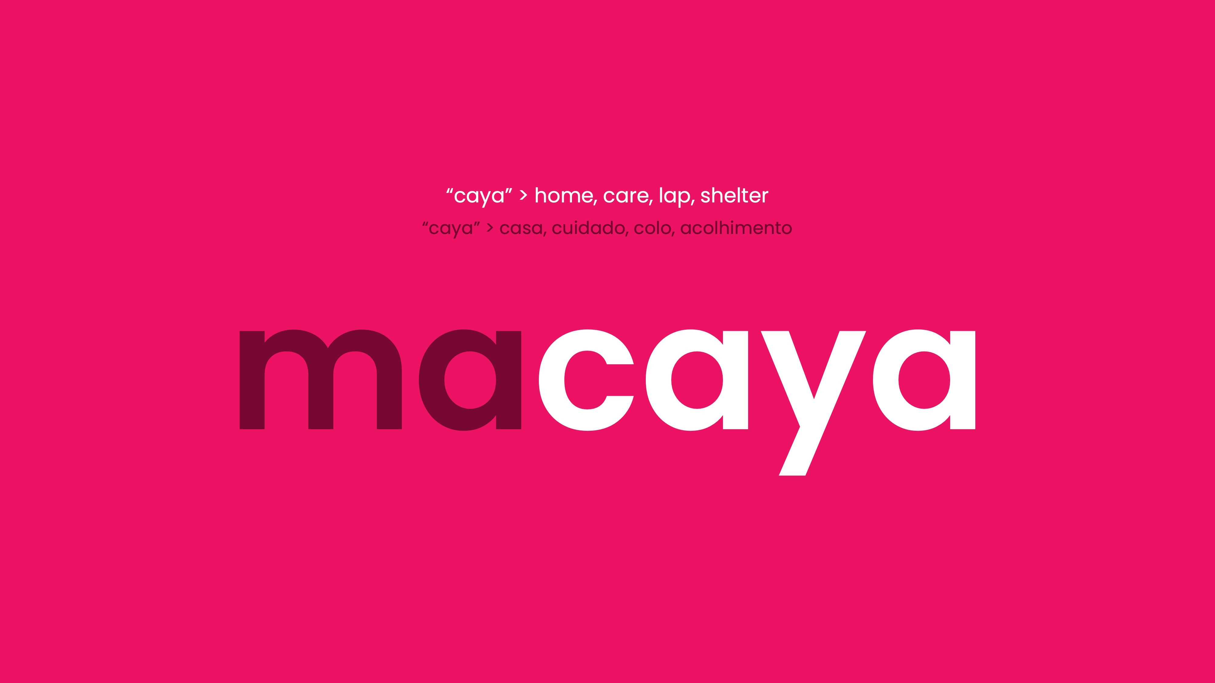
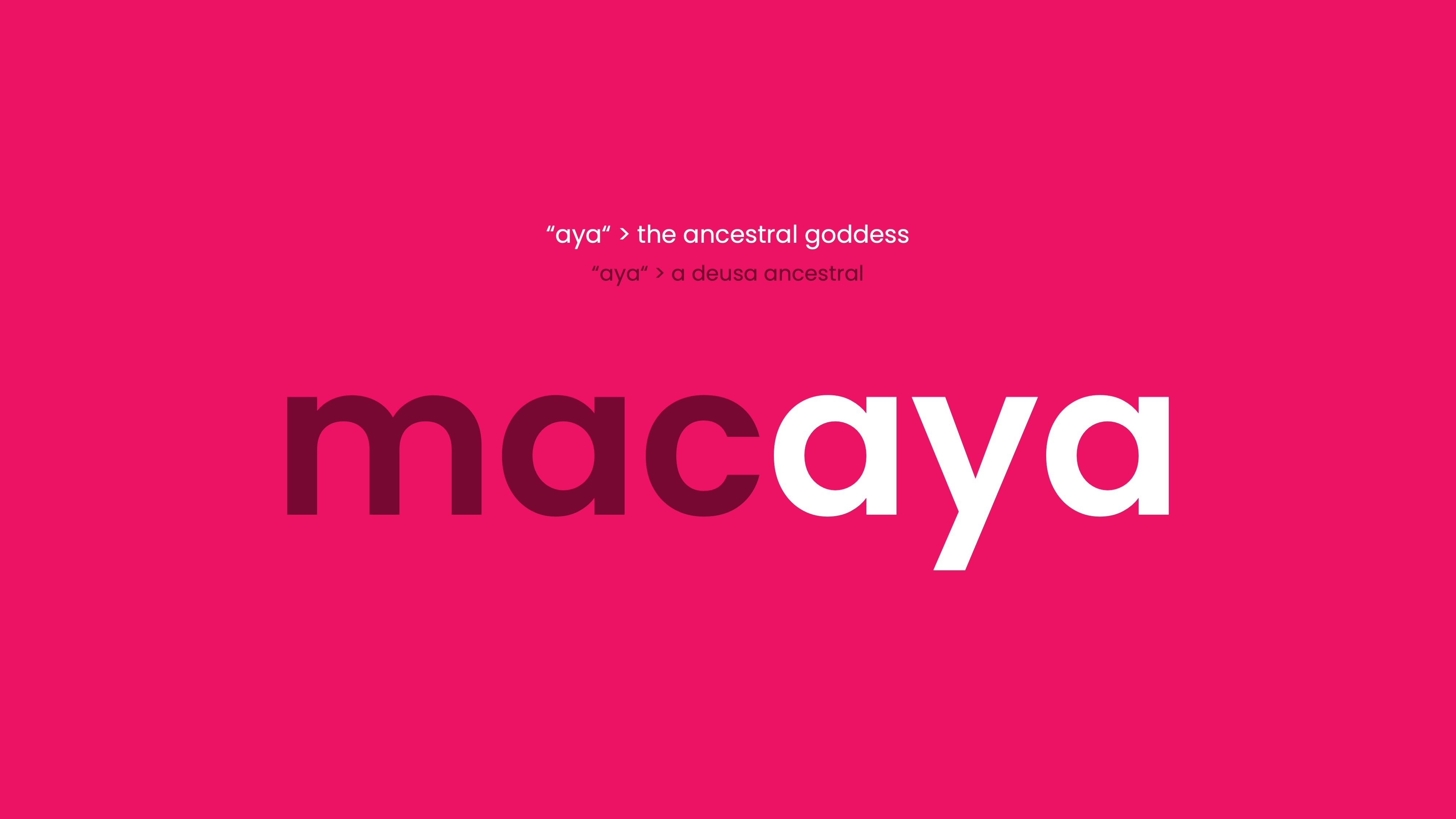
macaya was developed as a sound-led name built for warmth, recall, and extension. its three-syllable rhythm (ma–ca–ya) improves memorability and usability across languages, while staying distinctive for search and brand ownership.
the meaning system supports the brand without becoming literal: “ma” evokes care and raw material (mãe, mata, matéria-prima), “ca” nods to cacao (cacau), and “aya” connects to home, shelter, and ancestral feminine strength. set in lowercase, the name keeps the tone close and accessible—ready for architecture extensions such as macaya brasil, macaya sabor, and macaya saber.


visual identity
visual identity
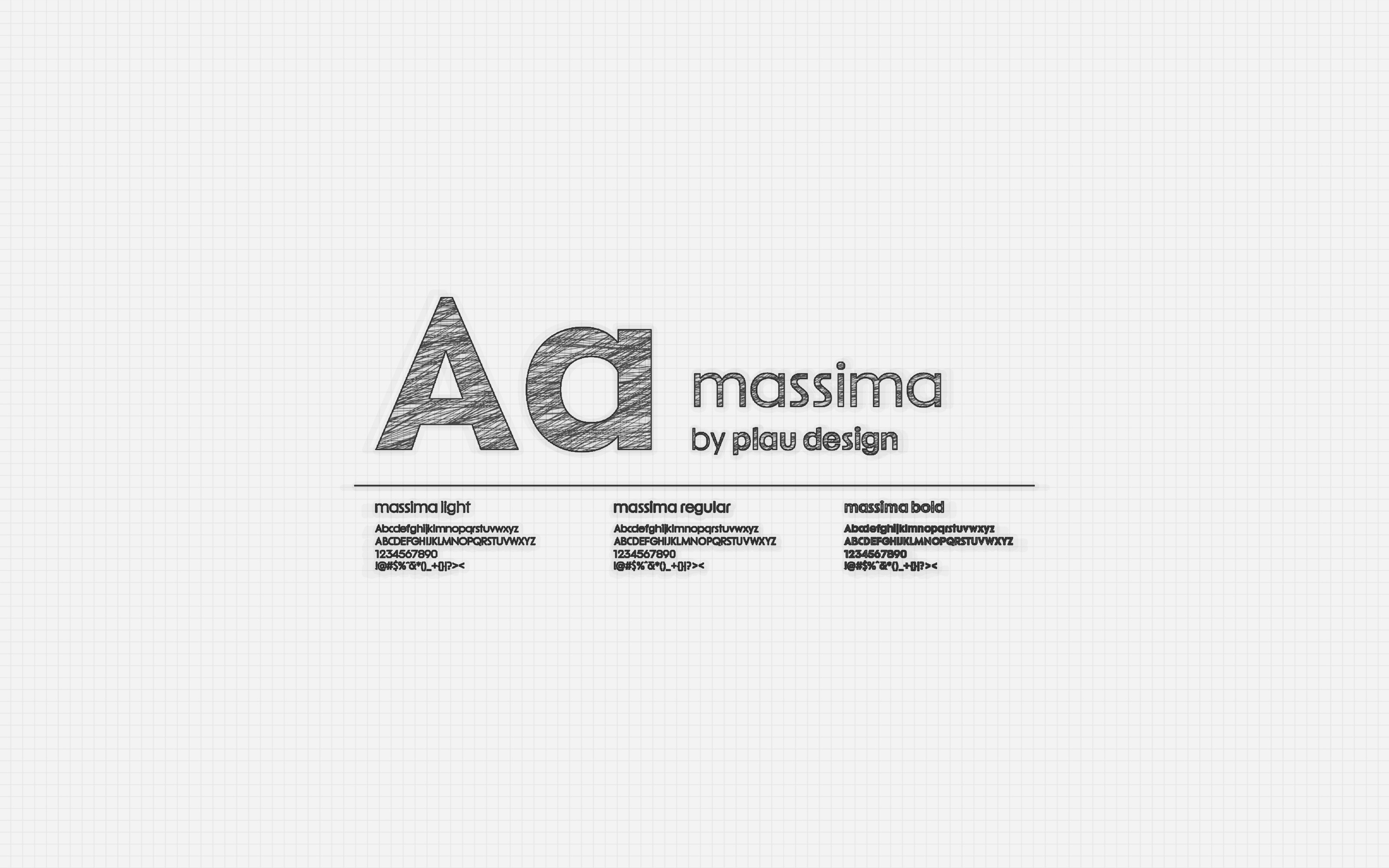
the visual identity was designed to feel premium and sensorial while staying structured and easy to apply. instead of relying on stereotypes, brasilidade is expressed through authorship and craft—starting with Massima by Plau Design, a brazilian typeface chosen intentionally to build a brand that is brazilian by origin.
typography sets the system’s voice: contemporary, legible, and distinctive, with a warmth that supports proximity without losing clarity. around it, the visual language balances sensorial cues (curves, texture, tactile elements) with structure (grid, hierarchy, and modular rules), so macaya can move between gifting moments, everyday consumption, and educational content while keeping a consistent signature.


color palette
color palette
color functions as a navigation layer for the ecosystem—supporting recognition, hierarchy, and quick understanding while keeping one unified macaya presence.
macaya saber is anchored in pink tones tied to care and storytelling, while macaya sabor uses cacao-driven browns and warm tones to signal appetite and craft. supporting greens connect communication back to nature and origin.


icon system
icon system
the icon system turns complex information into clear, friendly signals—supporting scanning on small surfaces like labels and mobile layouts. built with one consistent logic across both pillars, icons help macaya communicate ingredients, processes, tools, and learning modules without adding noise, keeping the tone warm, accessible, and system-consistent.
the icon system turns complex information into clear, friendly signals—supporting scanning on small surfaces like labels and mobile layouts. built with one consistent logic across both pillars, icons help macaya communicate ingredients, processes, tools, and learning modules without adding noise, keeping the tone warm, accessible, and system-consistent.

explore the brandbook
explore the brandbook
interactive flipbook
interactive flipbook
the brandbook documents macaya’s identity system—concept, visual language, typography, color logic, and core applications—showing how the brand stays consistent across packaging, digital touchpoints, and future extensions.
the brandbook documents macaya’s identity system—concept, visual language, typography, color logic, and core applications—showing how the brand stays consistent across packaging, digital touchpoints, and future extensions.

04
/applications
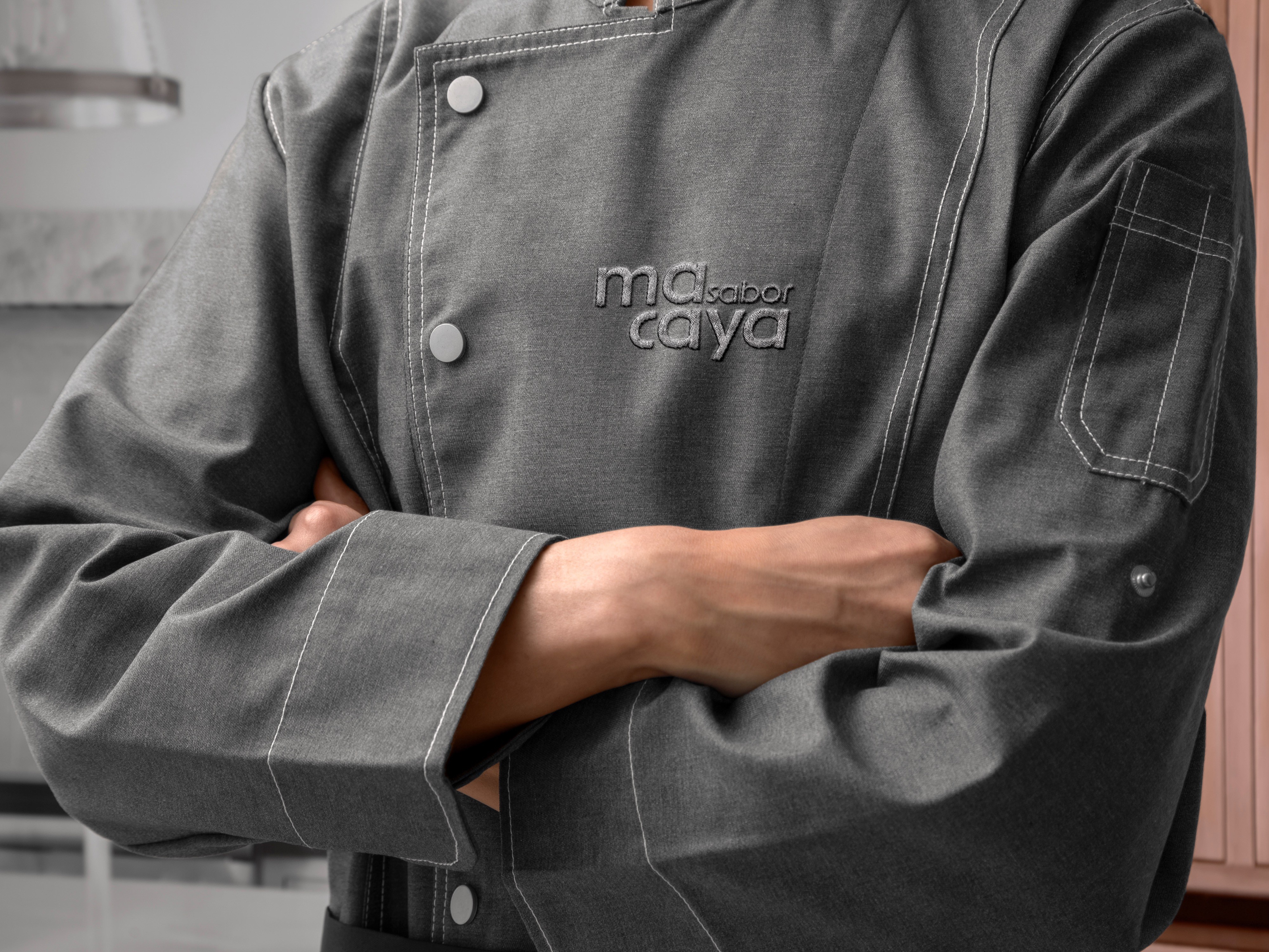
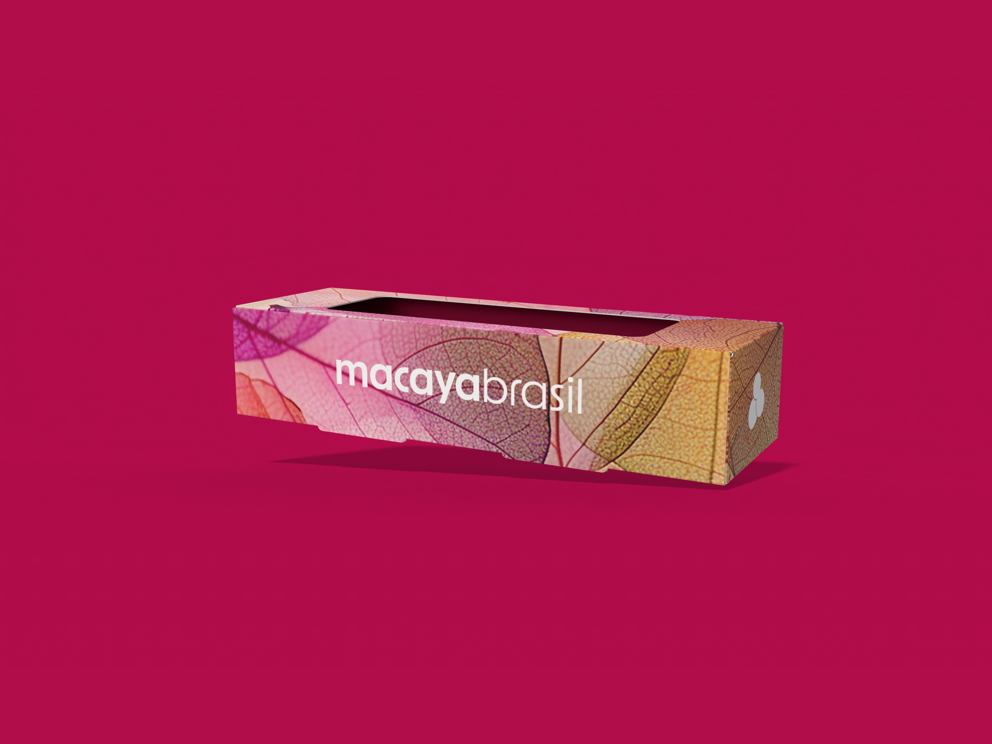
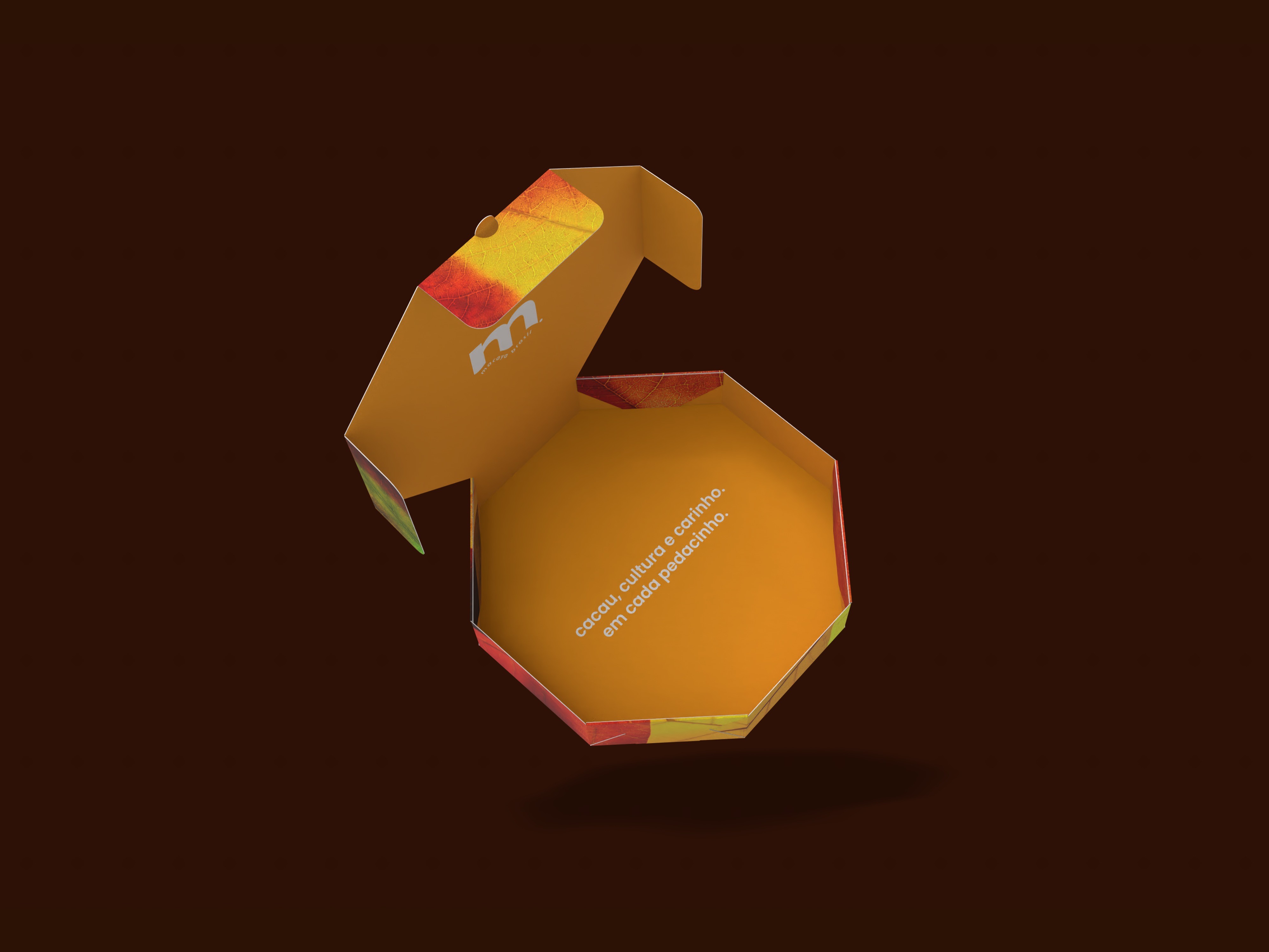
packaging system
packaging system
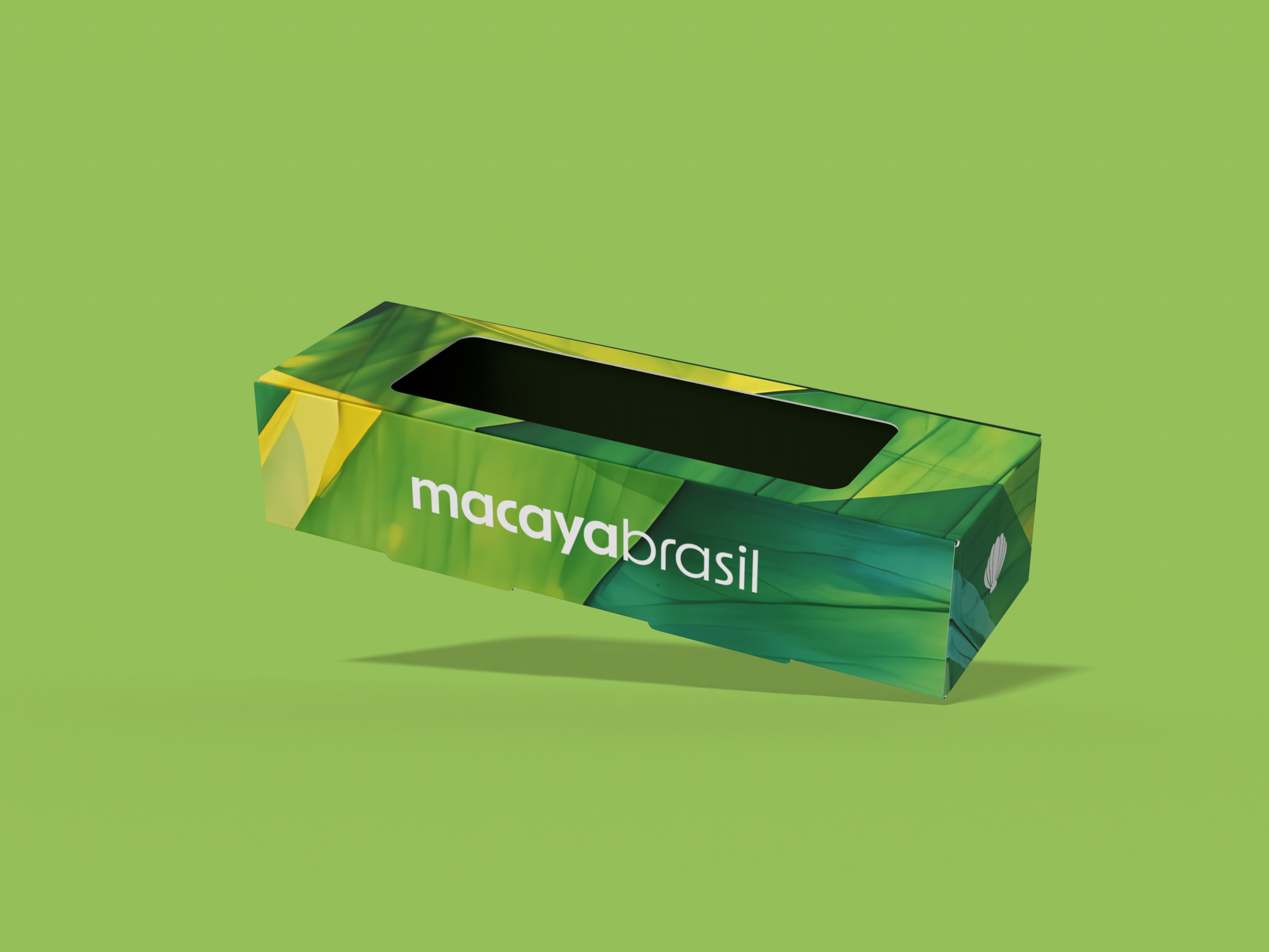
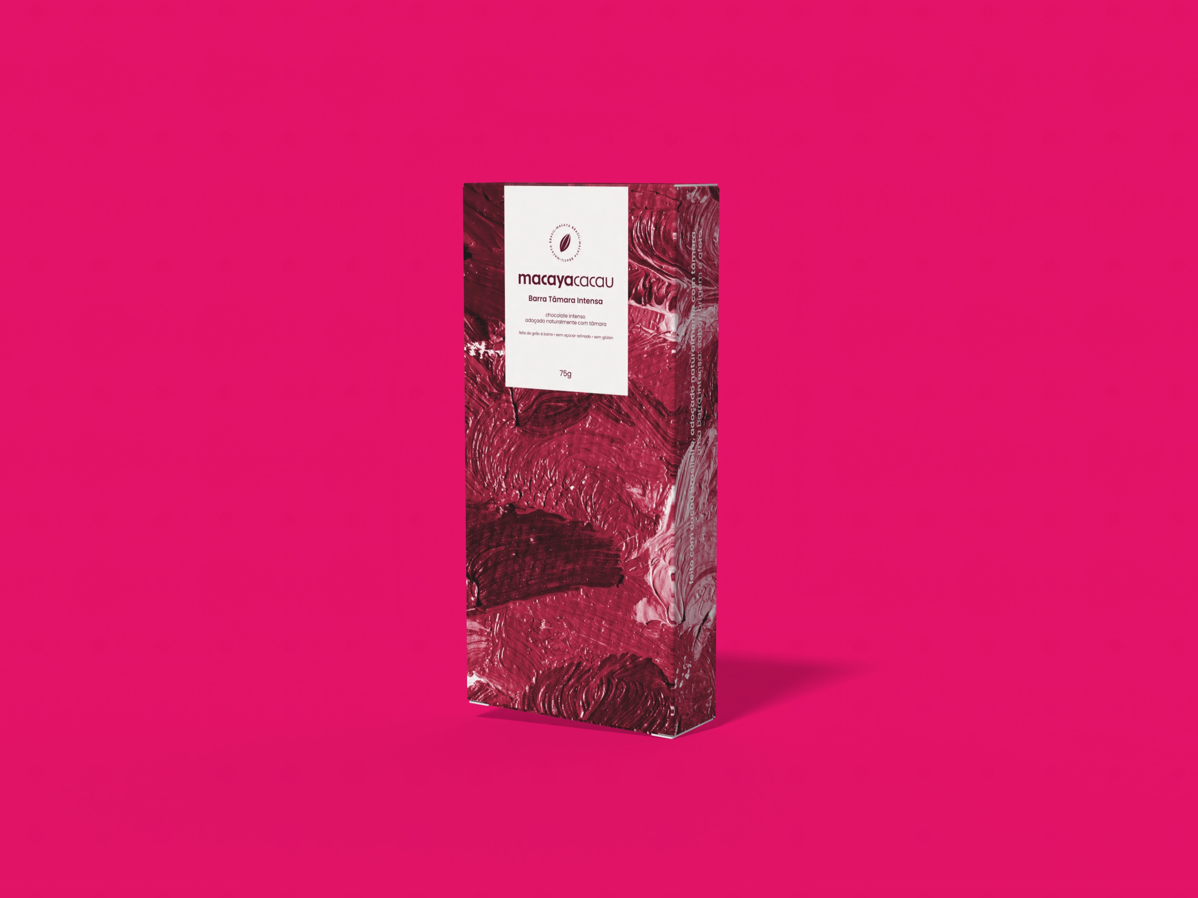
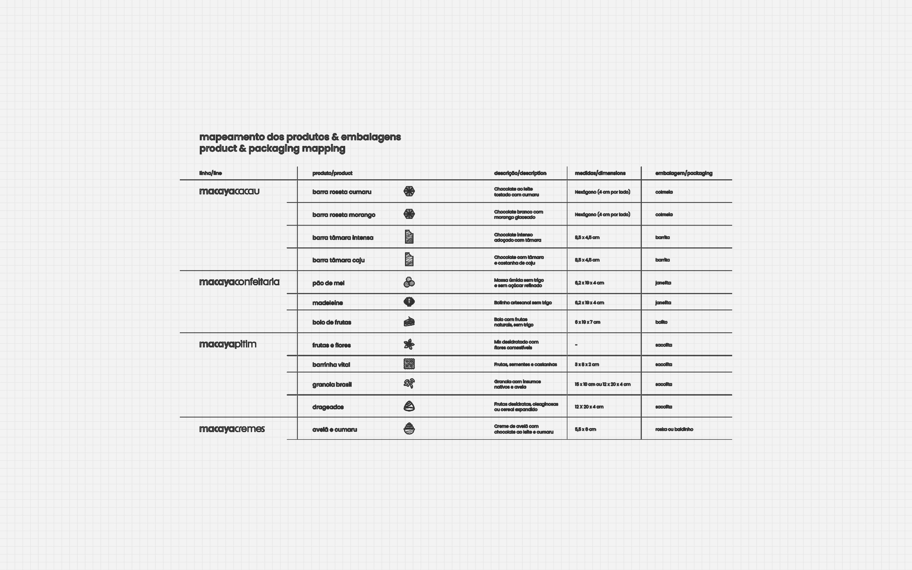
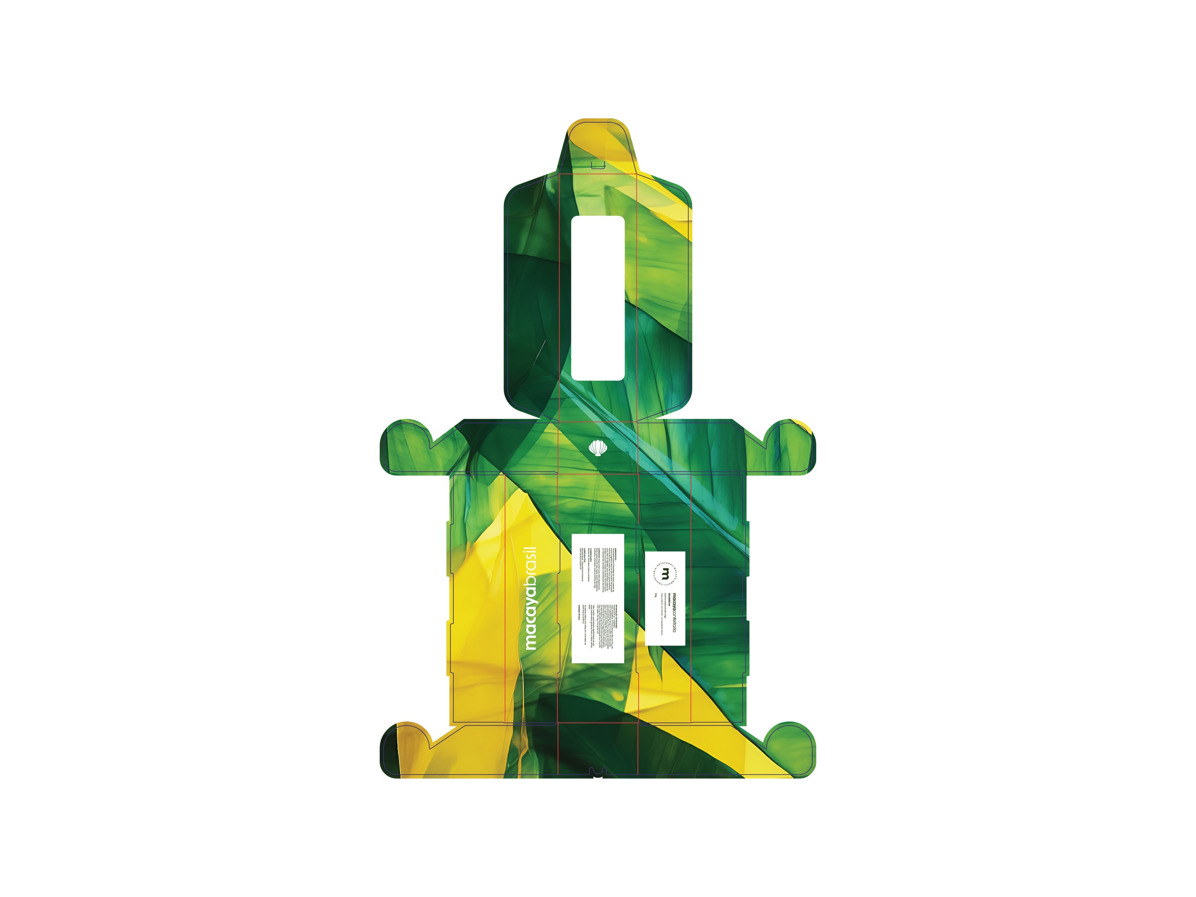
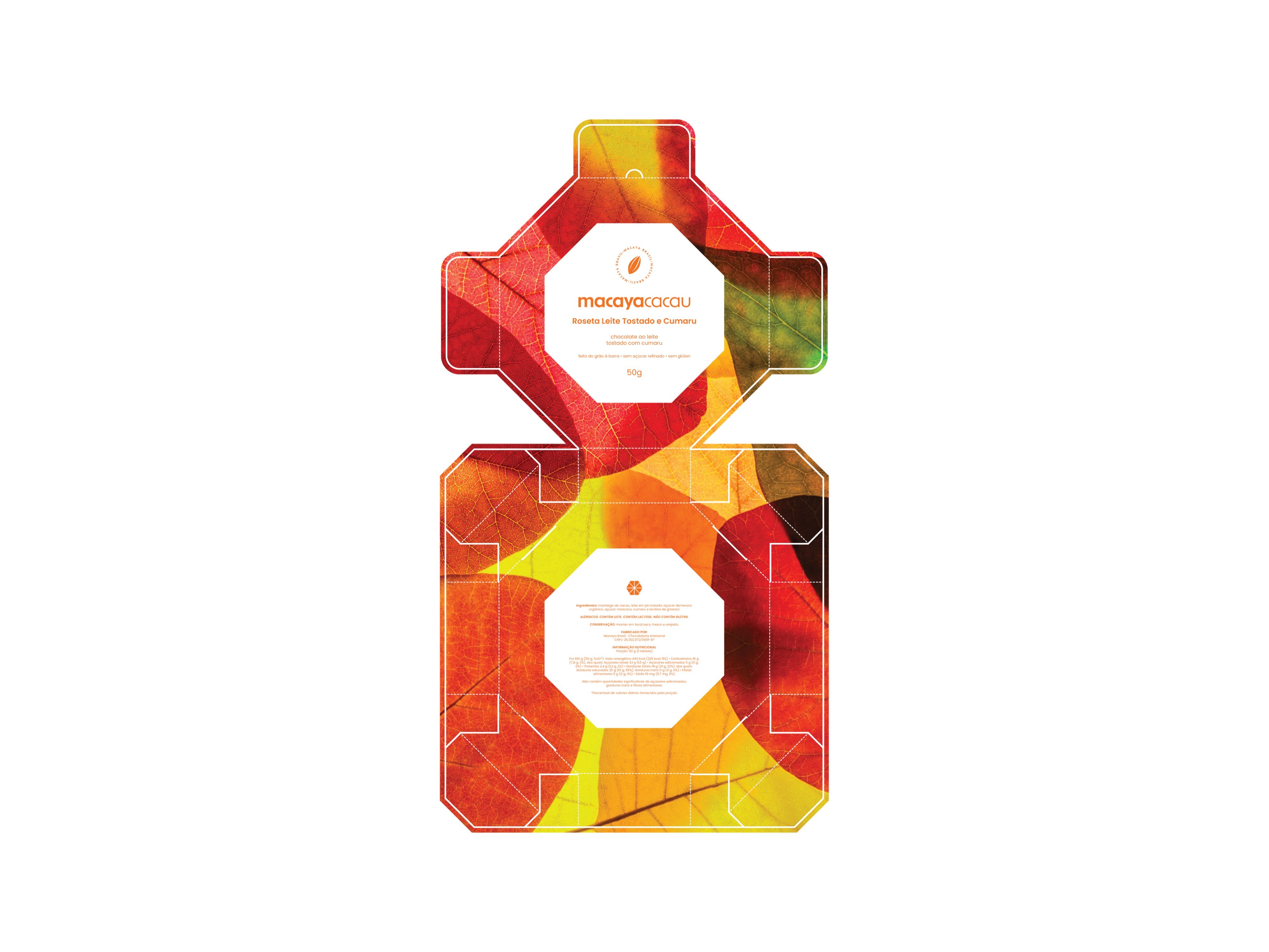
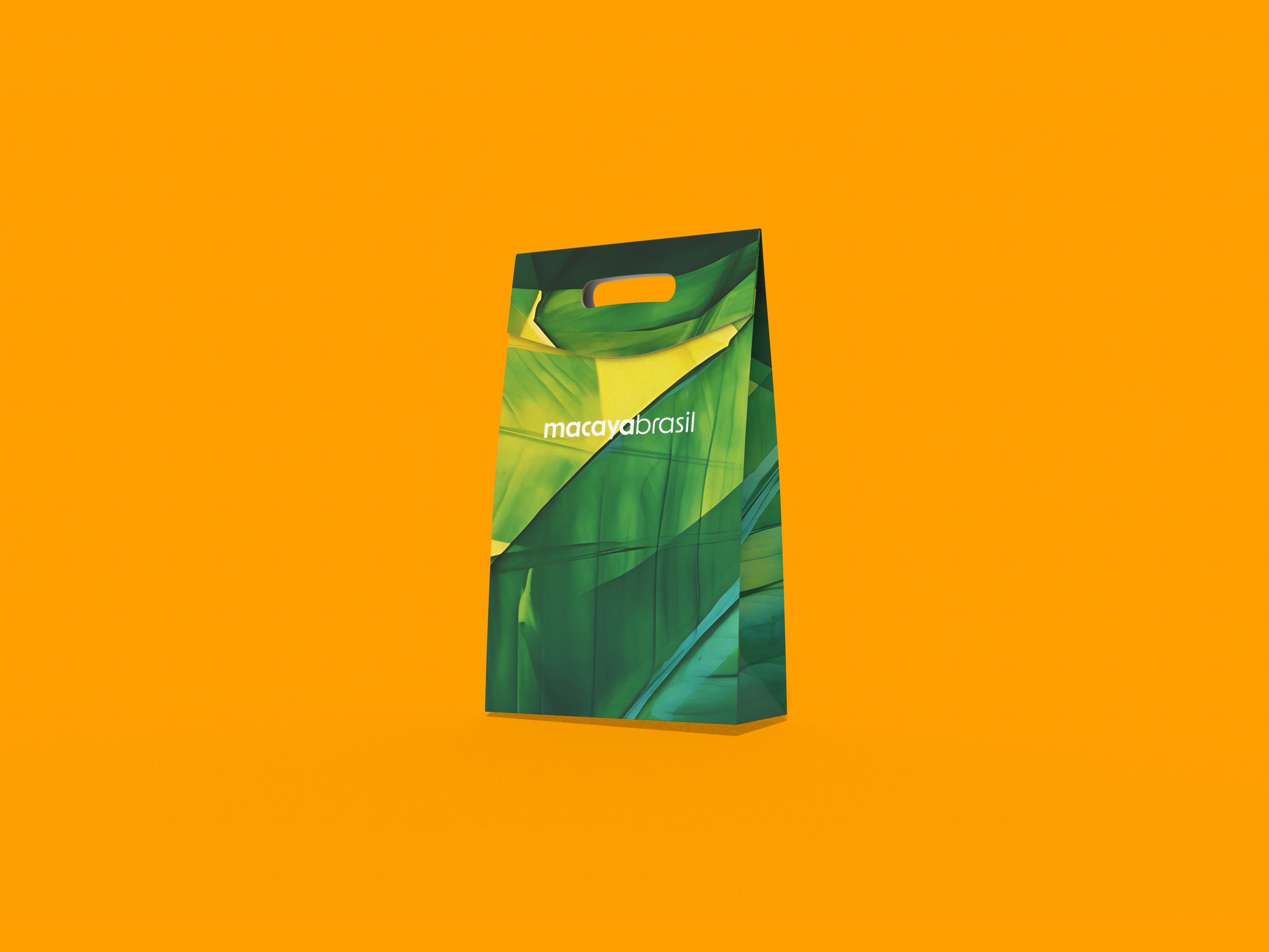
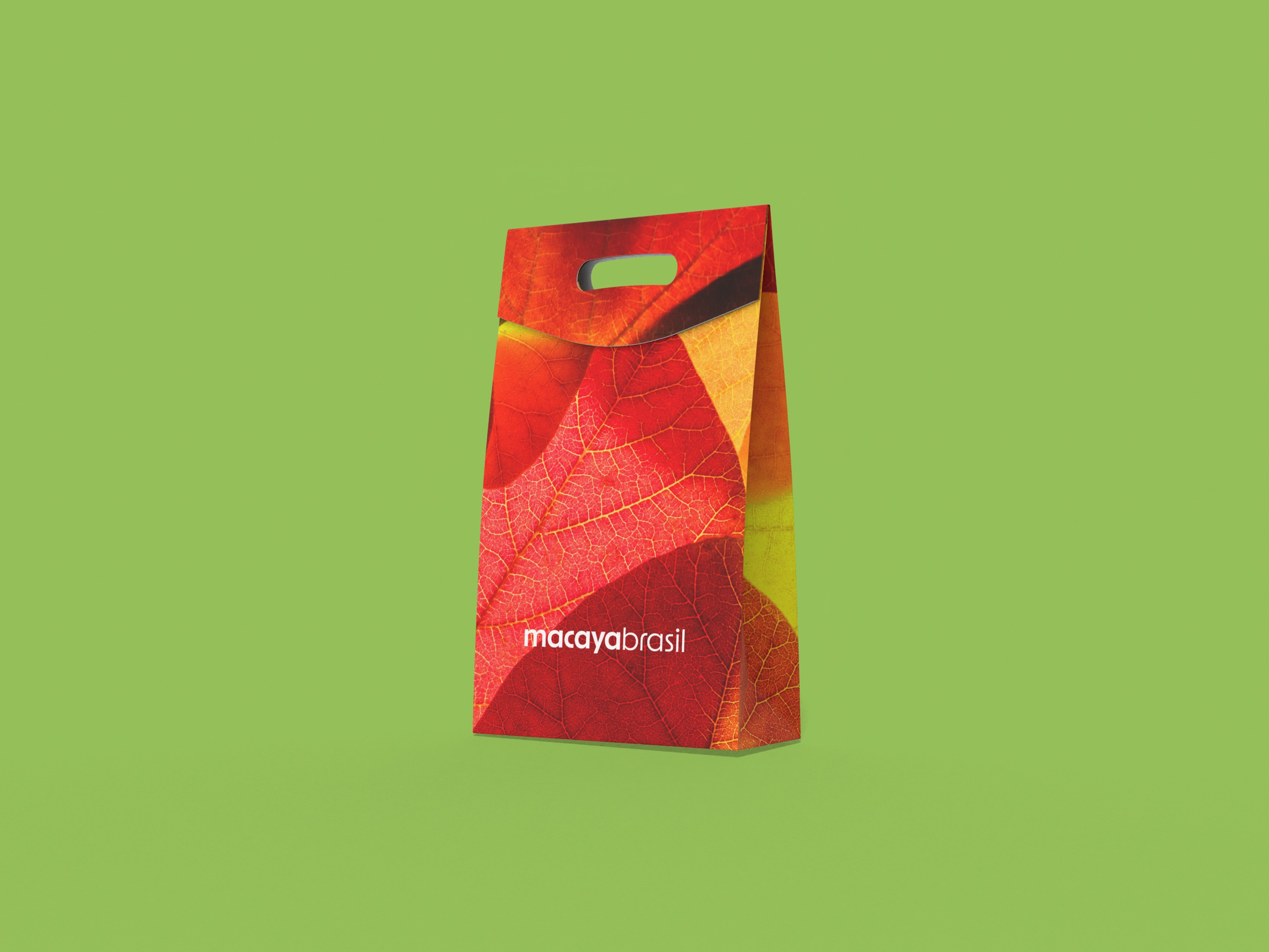
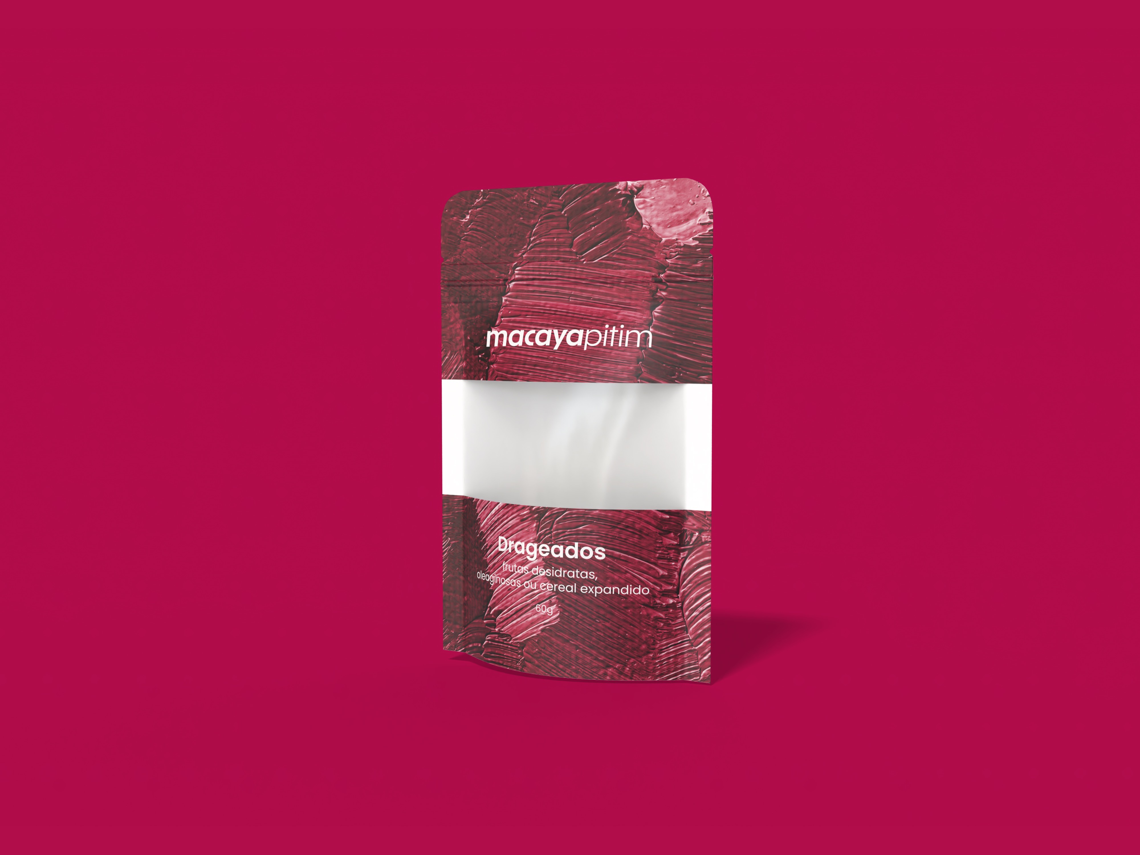
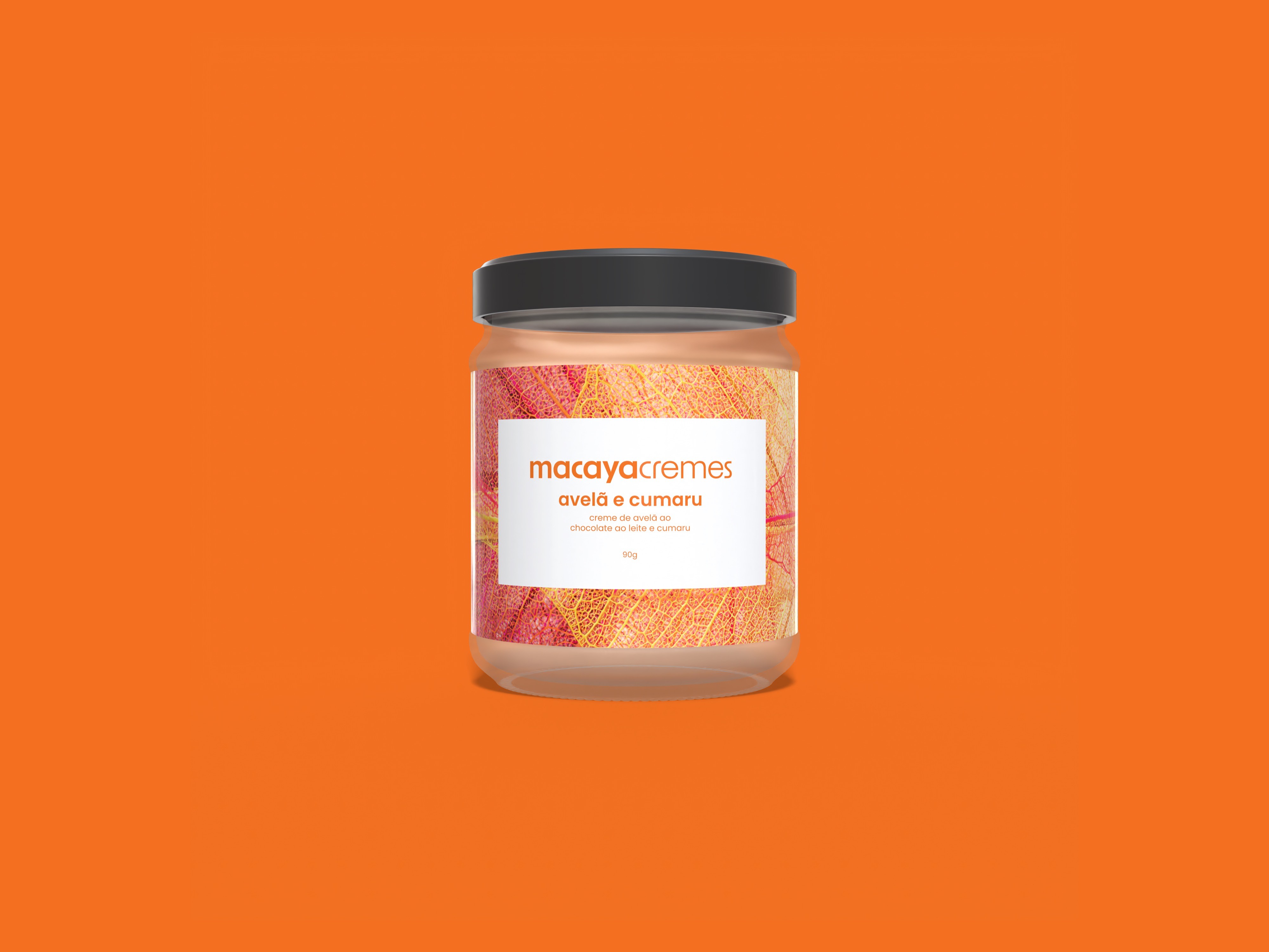
packaging is where macaya’s promise becomes physical: a sensorial extension of the brand designed to feel considered, giftable, and everyday-functional at once. the brandbook frames packaging as part of macaya’s universe—where “sabor” (flavor) meets “saber” (craft/knowledge)—so material, structure, and visual language work together to communicate care, presence, and quality beyond the product itself. the system is built to keep the universe readable and coherent: clear hierarchy, repeatable layout logic, and consistent placement of key information so each sku can feel specific without breaking the family.
to build this, we treated the brandbook as a usage guide: a flexible but consistent framework that translates identity into repeatable packaging decisions. we started by mapping the full offer (products and services), then converted it into a product-and-packaging map—what exists, what structure each sku requires, and which rules must stay stable across lines, sizes, and kits. only after formats were defined did we move into development: dielines and technical specifications first, then 3d build-ups to validate proportions, hierarchy, and shelf presence before finalizing artwork.
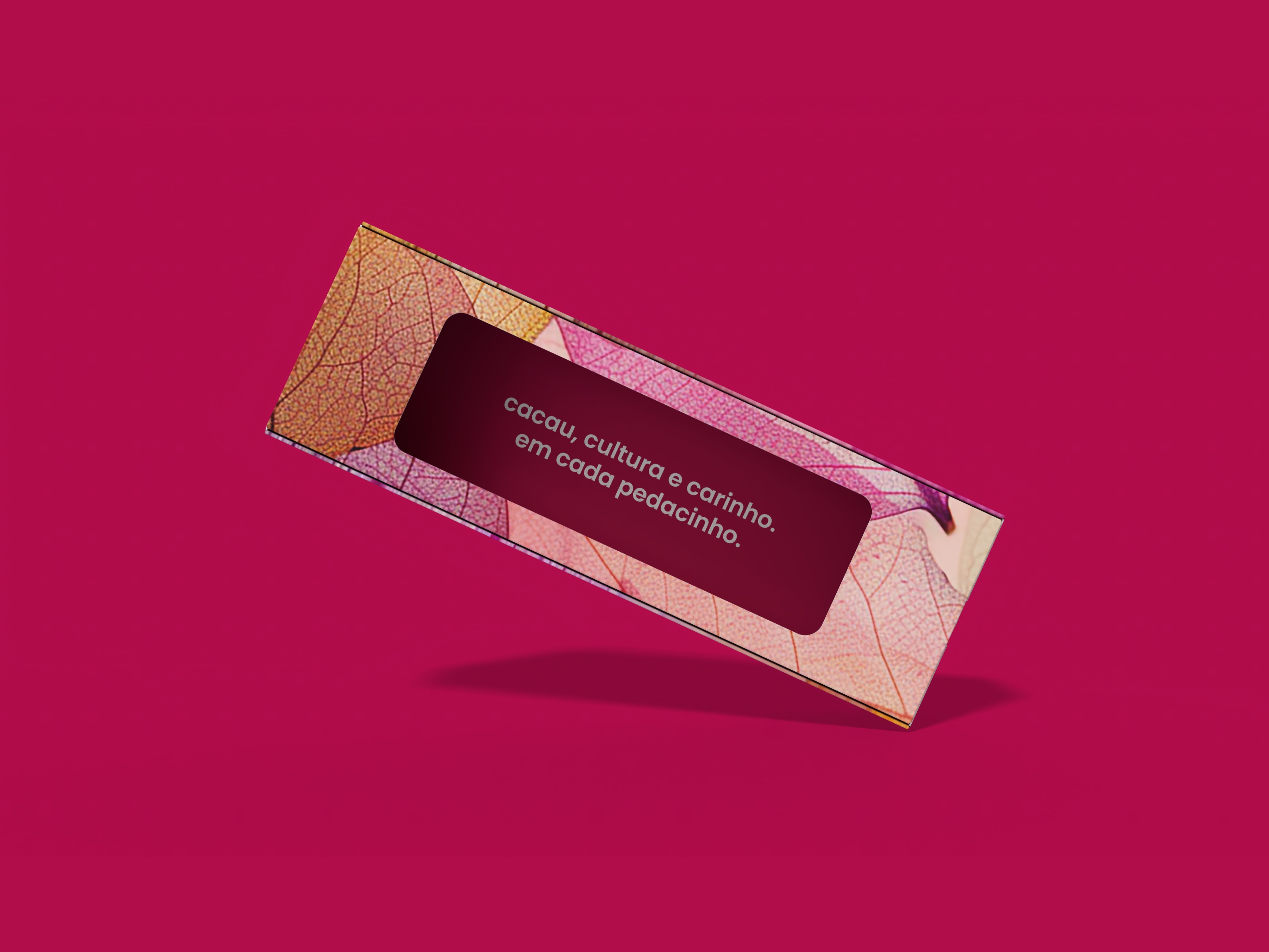
sustainability is approached as a design constraint, not an afterthought: structures were studied to reduce waste, and material/finish complexity was kept restrained to avoid unnecessary production layers. the system favors repeatable components to reduce variation across skus—making responsible choices easier to execute consistently, and supporting scale without increasing complexity. at the same time, packaging is designed to feel like a gift people want to keep and reuse, so the brand experience extends beyond consumption into memory, affection, and lasting value.
packaging is where macaya’s promise becomes physical: a sensorial extension of the brand designed to feel considered, giftable, and everyday-functional at once. the brandbook frames packaging as part of macaya’s universe—where “sabor” (flavor) meets “saber” (craft/knowledge)—so material, structure, and visual language work together to communicate care, presence, and quality beyond the product itself. the system is built to keep the universe readable and coherent: clear hierarchy, repeatable layout logic, and consistent placement of key information so each sku can feel specific without breaking the family.
to build this, we treated the brandbook as a usage guide: a flexible but consistent framework that translates identity into repeatable packaging decisions. we started by mapping the full offer (products and services), then converted it into a product-and-packaging map—what exists, what structure each sku requires, and which rules must stay stable across lines, sizes, and kits. only after formats were defined did we move into development: dielines and technical specifications first, then 3d build-ups to validate proportions, hierarchy, and shelf presence before finalizing artwork.
sustainability is approached as a design constraint, not an afterthought: structures were studied to reduce waste, and material/finish complexity was kept restrained to avoid unnecessary production layers. the system favors repeatable components to reduce variation across skus—making responsible choices easier to execute consistently, and supporting scale without increasing complexity. at the same time, packaging is designed to feel like a gift people want to keep and reuse, so the brand experience extends beyond consumption into memory, affection, and lasting value.


interactive packaging
interactive packaging
packaging: barrita (bar)
packaging: barrita (bar)
explore the packaging below — they are interactive: you can open, close, and rotate them.
explore the packaging below — they are interactive: you can open, close, and rotate them.
packaging: colmeia (hive)
packaging: colmeia (hive)
explore the packaging below — they are interactive: you can open, close, and rotate them.
explore the packaging below — they are interactive: you can open, close, and rotate them.
packaging: janelita (window)
packaging: janelita (window)
explore the packaging below — they are interactive: you can open, close, and rotate them.
explore the packaging below — they are interactive: you can open, close, and rotate them.
05
/recognition
recognition
recognition
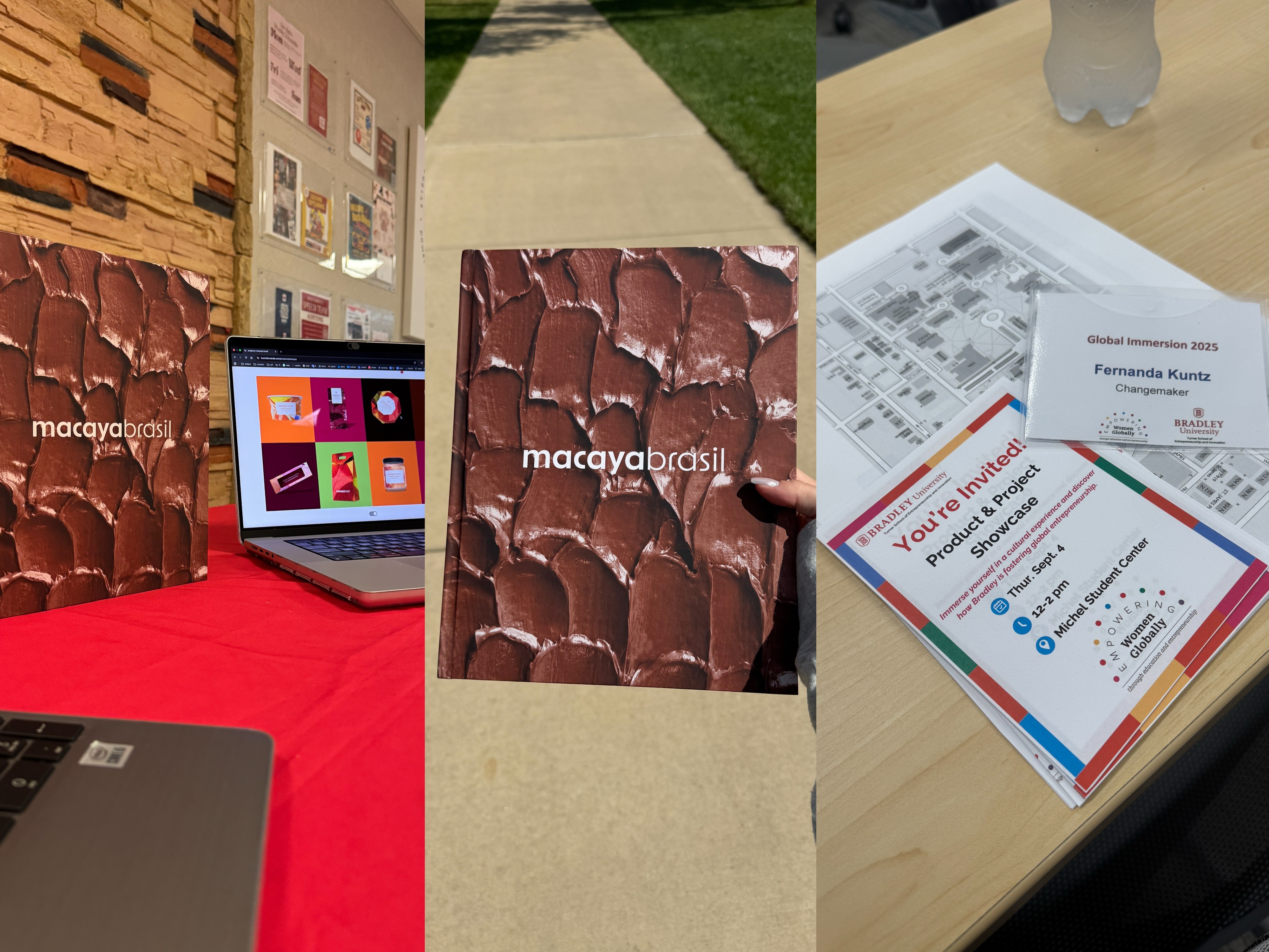
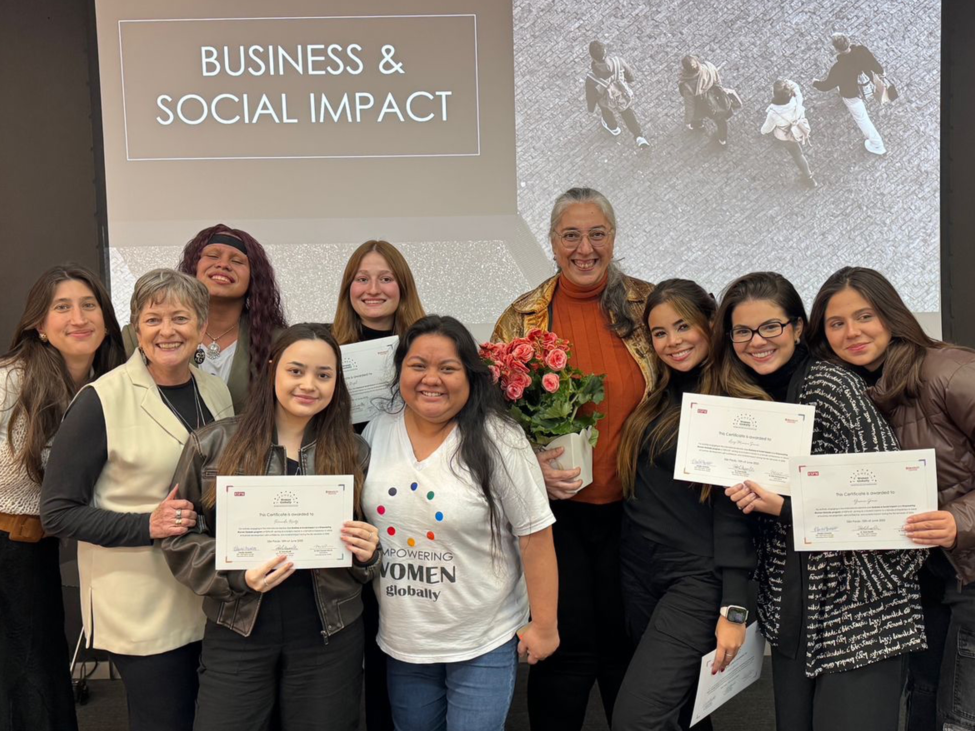
selected as a top project of the semester and invited to present at Bradley University (Peoria, IL, USA) through Empowering Women Globally’s Changemaker Program.
selected as a top project of the semester and invited to present at Bradley University (Peoria, IL, USA) through Empowering Women Globally’s Changemaker Program.
being selected to represent macaya in the USA changed the stakes. it wasn’t just “showing the project” — it was proving that the thinking, the craft, and the outcomes could stand up outside our local context, in front of people who didn’t share our references or our reality.
preparing for that presentation became a second design sprint. i had to translate the narrative for an international audiences, sharpen what truly differentiated the work (beyond aesthetics), and connect every choice to business logic, feasibility, and impact on the entrepreneur behind the brand. it forced me to communicate with more precision, anticipate questions, and defend decisions with evidence, not confidence.
the immersion itself was intense: a full week of classes and hands-on activities in english, discussing entrepreneurship, innovation, and social impact with people from different backgrounds. between workshops, campus sessions, and constant exchange, i was pushed to think faster, speak clearer, and show up with more presence. it shaped me beyond the project — professionally, by raising my standard for storytelling and accountability, and personally, by expanding what i believe is possible for my path.
it also reframed how i see cultural branding. it showed me that brazilian culture and craft don’t need exaggeration to be understood — they need authorship, clarity, and rigor. i came back proud, but also more responsible: i want to keep building brands that perform in real markets and carry meaning across borders — and keep earning opportunities that put my work on international stages.


macaya brasil
macaya brasil
macaya is an inclusive brazilian bean-to-bar confectionery and education brand founded by Glaucer Roda. through “sabor & saber” the brand combines cacao-based sweets designed for different dietary needs with learning experiences that make technical food knowledge accessible and practical.
developed during ESPM’s Empowering Women Globally Program, this project repositioned Glaucer’s original business (Domremy Artesaria) into macaya. we led the full rebrand—strategy and positioning, naming, and brand architecture (macaya sabor/macaya saber), then built the system to scale: a modular visual identity, packaging system, and social media foundations. beyond design, we supported the business model and revenue logic, and delivered an investor-ready presentation to help macaya communicate its value and growth plan clearly.
year
2025
2025
duration
6 months
6 months
my role
led naming, visual identity system, and packaging (design + dielines + 3d), and produced social templates, brandbook, and presentation.
led naming, visual identity system, and packaging (design + dielines + 3d), and produced social templates, brandbook, and presentation.
team contribution
Lucy Moreira, Lys Razel, Pietra Lacerda, Yasmin Gomes — outreach and growth toolkit (sales, suppliers, investor narrative) + social support.
Lucy Moreira, Lys Razel, Pietra Lacerda, Yasmin Gomes — outreach and growth toolkit (sales, suppliers, investor narrative) + social support.
01
/challenge
challenge
challenge
the brand began as Domremy Artesaria, but the name and identity were creating friction instead of recognition: the naming mixed foreign references (including “artesanía”), was difficult to pronounce and remember, and had low digital findability and weak semantic clarity for a brand grounded in brazilian ingredients and ancestry. visually, the logo was overloaded and hard to apply consistently across small formats, limiting usability for packaging and everyday communication. at a business level, the brand also needed to operate as one ecosystem with two clear offers—products and education—without fragmenting the story, while shifting from passive communication toward a structure that supports sales, partnerships, and future funding narratives.
the brand began as Domremy Artesaria, but the name and identity were creating friction instead of recognition: the naming mixed foreign references (including “artesanía”), was difficult to pronounce and remember, and had low digital findability and weak semantic clarity for a brand grounded in brazilian ingredients and ancestry. visually, the logo was overloaded and hard to apply consistently across small formats, limiting usability for packaging and everyday communication. at a business level, the brand also needed to operate as one ecosystem with two clear offers—products and education—without fragmenting the story, while shifting from passive communication toward a structure that supports sales, partnerships, and future funding narratives.
outcome
outcome
we repositioned and renamed the brand as macaya, establishing a more ownable, culturally aligned identity designed for clear recall and consistent application. we defined the brand architecture around two complementary fronts—macaya sabor (products) and macaya saber (education)—so each offer can grow independently while sharing one coherent signature and set of rules. the system includes structured identity assets (core mark and symbol variations for each front, typography, color logic, and iconography) and governance through a brandbook that translates strategy into repeatable decisions across packaging and communication—reducing inconsistency, improving legibility in small applications, and enabling faster rollout of new products and educational formats.
we repositioned and renamed the brand as macaya, establishing a more ownable, culturally aligned identity designed for clear recall and consistent application. we defined the brand architecture around two complementary fronts—macaya sabor (products) and macaya saber (education)—so each offer can grow independently while sharing one coherent signature and set of rules. the system includes structured identity assets (core mark and symbol variations for each front, typography, color logic, and iconography) and governance through a brandbook that translates strategy into repeatable decisions across packaging and communication—reducing inconsistency, improving legibility in small applications, and enabling faster rollout of new products and educational formats.
02
/strategy
strategy
strategy
to unlock clarity and scale, we made one structural decision early: rename domremy artesaria and rebuild the brand architecture. the previous name limited recall and discoverability, so we developed a sound- and meaning-led name that could carry a clearer system. from there, we translated the brand’s purpose into one cohesive framework—positioning, verbal tone, visual identity, packaging, social templates, and guidelines—so every touchpoint could operate with the same logic and stay consistent as the business grows.
macaya was positioned as a chocolate-and-impact brand where affection is the emotional differentiator and origin is the proof. rather than framing the offer as “healthy sweets,” we anchored the brand at the intersection of technique and ancestry—where food becomes a language that can nourish, teach, and transform. this was structured through two connected fronts: macaya sabor (products and sensorial experience) and macaya saber (education and knowledge-sharing), designed to reinforce each other while staying immediately understandable.
impact was treated as part of desire—not as responsibility messaging. origin, producers, conservation, and traceability became elements of value people can see, feel, and share, from ingredient choice to packaging decisions. to make this tangible, we defined a sensorial direction (texture, form, color energy, and language) and a communication structure guided by four pillars—relationship, authority, inspiration, and conversion—supported by the founder’s voice as a credibility anchor, while keeping the tone warm, elegant, and accessible.
to unlock clarity and scale, we made one structural decision early: rename domremy artesaria and rebuild the brand architecture. the previous name limited recall and discoverability, so we developed a sound- and meaning-led name that could carry a clearer system. from there, we translated the brand’s purpose into one cohesive framework—positioning, verbal tone, visual identity, packaging, social templates, and guidelines—so every touchpoint could operate with the same logic and stay consistent as the business grows.
macaya was positioned as a chocolate-and-impact brand where affection is the emotional differentiator and origin is the proof. rather than framing the offer as “healthy sweets,” we anchored the brand at the intersection of technique and ancestry—where food becomes a language that can nourish, teach, and transform. this was structured through two connected fronts: macaya sabor (products and sensorial experience) and macaya saber (education and knowledge-sharing), designed to reinforce each other while staying immediately understandable.
impact was treated as part of desire—not as responsibility messaging. origin, producers, conservation, and traceability became elements of value people can see, feel, and share, from ingredient choice to packaging decisions. to make this tangible, we defined a sensorial direction (texture, form, color energy, and language) and a communication structure guided by four pillars—relationship, authority, inspiration, and conversion—supported by the founder’s voice as a credibility anchor, while keeping the tone warm, elegant, and accessible.
before
before
after
after
packaging
social media
03
/system
identity system
identity system
the identity system translates macaya’s positioning into a cohesive toolkit built for consistency across touchpoints. it holds one clear signature while organizing the ecosystem through two fronts—macaya sabor (products and sensorial experience) and macaya saber (education and knowledge-sharing)—so the brand remains easy to navigate and recognizable across formats.
built as a modular system, it includes a complete mark family (primary logotype, responsive lockups, and a shorthand symbol), architecture signatures (macayabrasil, macaya sabor, macaya saber), and a structured typography approach anchored in a brazilian type choice—reinforcing brasilidade through authorship rather than stereotypes. color operates as a functional layer to support hierarchy and wayfinding, supported by an icon set for scanning and storytelling, plus textures, shapes, and image direction that build a sensorial world connected to cacao and nature.
the system extends into practical rules for packaging and digital communication—information hierarchy, layout rhythm, variation logic, dielines, and social templates (grid structure, post/story modules, and navigation assets)—supported by guidelines for consistent application over time. the result is a premium yet warm brand experience that stays coherent as it scales, while making the macaya ecosystem easy to understand at a glance.
mark development
mark development
the macaya mark was designed as a responsive system—not a single fixed logo—so it performs consistently across packaging, digital touchpoints, and educational materials. starting from the brand architecture, we built a family of lockups that holds up under real constraints, from small avatars to complex packaging hierarchies and future extensions. the result is a contemporary typographic signature in lowercase, supported by modular variations that protect legibility, recognition, and clear labeling across macaya’s pillars.
the macaya mark was designed as a responsive system—not a single fixed logo—so it performs consistently across packaging, digital touchpoints, and educational materials. starting from the brand architecture, we built a family of lockups that holds up under real constraints, from small avatars to complex packaging hierarchies and future extensions. the result is a contemporary typographic signature in lowercase, supported by modular variations that protect legibility, recognition, and clear labeling across macaya’s pillars.
naming process
naming process
macaya was developed as a sound-led name built for warmth, recall, and extension. its three-syllable rhythm (ma–ca–ya) improves memorability and usability across languages, while staying distinctive for search and brand ownership.
the meaning system supports the brand without becoming literal: “ma” evokes care and raw material (mãe, mata, matéria-prima), “ca” nods to cacao (cacau), and “aya” connects to home, shelter, and ancestral feminine strength. set in lowercase, the name keeps the tone close and accessible—ready for architecture extensions such as macaya brasil, macaya sabor, and macaya saber.
visual identity
visual identity
the visual identity was designed to feel premium and sensorial while staying structured and easy to apply. instead of relying on stereotypes, brasilidade is expressed through authorship and craft—starting with Massima by Plau Design, a brazilian typeface chosen intentionally to build a brand that is brazilian by origin.
typography sets the system’s voice: contemporary, legible, and distinctive, with a warmth that supports proximity without losing clarity. around it, the visual language balances sensorial cues (curves, texture, tactile elements) with structure (grid, hierarchy, and modular rules), so macaya can move between gifting moments, everyday consumption, and educational content while keeping a consistent signature.
color palette
color palette
color functions as a navigation layer for the ecosystem—supporting recognition, hierarchy, and quick understanding while keeping one unified macaya presence.
macaya saber is anchored in pink tones tied to care and storytelling, while macaya sabor uses cacao-driven browns and warm tones to signal appetite and craft. supporting greens connect communication back to nature and origin.
icon system
icon system
the icon system turns complex information into clear, friendly signals—supporting scanning on small surfaces like labels and mobile layouts. built with one consistent logic across both pillars, icons help macaya communicate ingredients, processes, tools, and learning modules without adding noise, keeping the tone warm, accessible, and system-consistent.
the icon system turns complex information into clear, friendly signals—supporting scanning on small surfaces like labels and mobile layouts. built with one consistent logic across both pillars, icons help macaya communicate ingredients, processes, tools, and learning modules without adding noise, keeping the tone warm, accessible, and system-consistent.
explore the brandbook
explore the brandbook
interactive flipbook
interactive flipbook
the brandbook documents macaya’s identity system—concept, visual language, typography, color logic, and core applications—showing how the brand stays consistent across packaging, digital touchpoints, and future extensions.
the brandbook documents macaya’s identity system—concept, visual language, typography, color logic, and core applications—showing how the brand stays consistent across packaging, digital touchpoints, and future extensions.
04
/applications
packaging system
packaging system
packaging is where macaya’s promise becomes physical: a sensorial extension of the brand designed to feel considered, giftable, and everyday-functional at once. the brandbook frames packaging as part of macaya’s universe—where “sabor” (flavor) meets “saber” (craft/knowledge)—so material, structure, and visual language work together to communicate care, presence, and quality beyond the product itself. the system is built to keep the universe readable and coherent: clear hierarchy, repeatable layout logic, and consistent placement of key information so each sku can feel specific without breaking the family.
to build this, we treated the brandbook as a usage guide: a flexible but consistent framework that translates identity into repeatable packaging decisions. we started by mapping the full offer (products and services), then converted it into a product-and-packaging map—what exists, what structure each sku requires, and which rules must stay stable across lines, sizes, and kits. only after formats were defined did we move into development: dielines and technical specifications first, then 3d build-ups to validate proportions, hierarchy, and shelf presence before finalizing artwork.
sustainability is approached as a design constraint, not an afterthought: structures were studied to reduce waste, and material/finish complexity was kept restrained to avoid unnecessary production layers. the system favors repeatable components to reduce variation across skus—making responsible choices easier to execute consistently, and supporting scale without increasing complexity. at the same time, packaging is designed to feel like a gift people want to keep and reuse, so the brand experience extends beyond consumption into memory, affection, and lasting value.
interactive packaging
interactive packaging
packaging: barrita (bar)
packaging: barrita (bar)
explore the packaging below — they are interactive: you can open, close, and rotate them.
explore the packaging below — they are interactive: you can open, close, and rotate them.
packaging: colmeia (hive)
packaging: colmeia (hive)
explore the packaging below — they are interactive: you can open, close, and rotate them.
explore the packaging below — they are interactive: you can open, close, and rotate them.
packaging: janelita (window)
packaging: janelita (window)
explore the packaging below — they are interactive: you can open, close, and rotate them.
explore the packaging below — they are interactive: you can open, close, and rotate them.
social media
social media
social media was designed as the daily expression of the ecosystem, allowing macaya to speak about pleasure, origin, and impact without becoming heavy—and to educate without feeling academic. the instagram presence was rebuilt with clear navigation assets and a modular template system for posts and stories, translating the brand into high-frequency communication that still feels premium and cohesive. the content structure supports both gifting moments and everyday rituals, balancing strong typography and pillar cues with sensorial imagery and clear scanning so macaya remains recognizable, approachable, and consistent across launches, education, community storytelling, and conversion-driven touchpoints.
social media was designed as the daily expression of the ecosystem, allowing macaya to speak about pleasure, origin, and impact without becoming heavy—and to educate without feeling academic. the instagram presence was rebuilt with clear navigation assets and a modular template system for posts and stories, translating the brand into high-frequency communication that still feels premium and cohesive. the content structure supports both gifting moments and everyday rituals, balancing strong typography and pillar cues with sensorial imagery and clear scanning so macaya remains recognizable, approachable, and consistent across launches, education, community storytelling, and conversion-driven touchpoints.


05
/recognition
recognition
recognition
selected as a top project of the semester and invited to present at Bradley University (Peoria, IL, USA) through Empowering Women Globally’s Changemaker Program.
selected as a top project of the semester and invited to present at Bradley University (Peoria, IL, USA) through Empowering Women Globally’s Changemaker Program.
being selected to represent macaya in the USA changed the stakes. it wasn’t just “showing the project” — it was proving that the thinking, the craft, and the outcomes could stand up outside our local context, in front of people who didn’t share our references or our reality.
preparing for that presentation became a second design sprint. i had to translate the narrative for an international audiences, sharpen what truly differentiated the work (beyond aesthetics), and connect every choice to business logic, feasibility, and impact on the entrepreneur behind the brand. it forced me to communicate with more precision, anticipate questions, and defend decisions with evidence, not confidence.
the immersion itself was intense: a full week of classes and hands-on activities in english, discussing entrepreneurship, innovation, and social impact with people from different backgrounds. between workshops, campus sessions, and constant exchange, i was pushed to think faster, speak clearer, and show up with more presence. it shaped me beyond the project — professionally, by raising my standard for storytelling and accountability, and personally, by expanding what i believe is possible for my path.
it also reframed how i see cultural branding. it showed me that brazilian culture and craft don’t need exaggeration to be understood — they need authorship, clarity, and rigor. i came back proud, but also more responsible: i want to keep building brands that perform in real markets and carry meaning across borders — and keep earning opportunities that put my work on international stages.
macaya brasil
macaya brasil
macaya is an inclusive brazilian bean-to-bar confectionery and education brand founded by Glaucer Roda. through “sabor & saber” the brand combines cacao-based sweets designed for different dietary needs with learning experiences that make technical food knowledge accessible and practical.
developed during ESPM’s Empowering Women Globally Program, this project repositioned Glaucer’s original business (Domremy Artesaria) into macaya. we led the full rebrand—strategy and positioning, naming, and brand architecture (macaya sabor/macaya saber), then built the system to scale: a modular visual identity, packaging system, and social media foundations. beyond design, we supported the business model and revenue logic, and delivered an investor-ready presentation to help macaya communicate its value and growth plan clearly.
year
2025
2025
duration
6 months
6 months
my role
led naming, visual identity system, and packaging (design + dielines + 3d), and produced social templates, brandbook, and presentation.
led naming, visual identity system, and packaging (design + dielines + 3d), and produced social templates, brandbook, and presentation.
team contribution
Lucy Moreira, Lys Razel, Pietra Lacerda, Yasmin Gomes — outreach and growth toolkit (sales, suppliers, investor narrative) + social support.
Lucy Moreira, Lys Razel, Pietra Lacerda, Yasmin Gomes — outreach and growth toolkit (sales, suppliers, investor narrative) + social support.
01
/challenge
challenge
challenge
the brand began as Domremy Artesaria, but the name and identity were creating friction instead of recognition: the naming mixed foreign references (including “artesanía”), was difficult to pronounce and remember, and had low digital findability and weak semantic clarity for a brand grounded in brazilian ingredients and ancestry. visually, the logo was overloaded and hard to apply consistently across small formats, limiting usability for packaging and everyday communication. at a business level, the brand also needed to operate as one ecosystem with two clear offers—products and education—without fragmenting the story, while shifting from passive communication toward a structure that supports sales, partnerships, and future funding narratives.
the brand began as Domremy Artesaria, but the name and identity were creating friction instead of recognition: the naming mixed foreign references (including “artesanía”), was difficult to pronounce and remember, and had low digital findability and weak semantic clarity for a brand grounded in brazilian ingredients and ancestry. visually, the logo was overloaded and hard to apply consistently across small formats, limiting usability for packaging and everyday communication. at a business level, the brand also needed to operate as one ecosystem with two clear offers—products and education—without fragmenting the story, while shifting from passive communication toward a structure that supports sales, partnerships, and future funding narratives.
outcome
outcome
we repositioned and renamed the brand as macaya, establishing a more ownable, culturally aligned identity designed for clear recall and consistent application. we defined the brand architecture around two complementary fronts—macaya sabor (products) and macaya saber (education)—so each offer can grow independently while sharing one coherent signature and set of rules. the system includes structured identity assets (core mark and symbol variations for each front, typography, color logic, and iconography) and governance through a brandbook that translates strategy into repeatable decisions across packaging and communication—reducing inconsistency, improving legibility in small applications, and enabling faster rollout of new products and educational formats.
we repositioned and renamed the brand as macaya, establishing a more ownable, culturally aligned identity designed for clear recall and consistent application. we defined the brand architecture around two complementary fronts—macaya sabor (products) and macaya saber (education)—so each offer can grow independently while sharing one coherent signature and set of rules. the system includes structured identity assets (core mark and symbol variations for each front, typography, color logic, and iconography) and governance through a brandbook that translates strategy into repeatable decisions across packaging and communication—reducing inconsistency, improving legibility in small applications, and enabling faster rollout of new products and educational formats.
02
/strategy
strategy
strategy
to unlock clarity and scale, we made one structural decision early: rename domremy artesaria and rebuild the brand architecture. the previous name limited recall and discoverability, so we developed a sound- and meaning-led name that could carry a clearer system. from there, we translated the brand’s purpose into one cohesive framework—positioning, verbal tone, visual identity, packaging, social templates, and guidelines—so every touchpoint could operate with the same logic and stay consistent as the business grows.
macaya was positioned as a chocolate-and-impact brand where affection is the emotional differentiator and origin is the proof. rather than framing the offer as “healthy sweets,” we anchored the brand at the intersection of technique and ancestry—where food becomes a language that can nourish, teach, and transform. this was structured through two connected fronts: macaya sabor (products and sensorial experience) and macaya saber (education and knowledge-sharing), designed to reinforce each other while staying immediately understandable.
impact was treated as part of desire—not as responsibility messaging. origin, producers, conservation, and traceability became elements of value people can see, feel, and share, from ingredient choice to packaging decisions. to make this tangible, we defined a sensorial direction (texture, form, color energy, and language) and a communication structure guided by four pillars—relationship, authority, inspiration, and conversion—supported by the founder’s voice as a credibility anchor, while keeping the tone warm, elegant, and accessible.
to unlock clarity and scale, we made one structural decision early: rename domremy artesaria and rebuild the brand architecture. the previous name limited recall and discoverability, so we developed a sound- and meaning-led name that could carry a clearer system. from there, we translated the brand’s purpose into one cohesive framework—positioning, verbal tone, visual identity, packaging, social templates, and guidelines—so every touchpoint could operate with the same logic and stay consistent as the business grows.
macaya was positioned as a chocolate-and-impact brand where affection is the emotional differentiator and origin is the proof. rather than framing the offer as “healthy sweets,” we anchored the brand at the intersection of technique and ancestry—where food becomes a language that can nourish, teach, and transform. this was structured through two connected fronts: macaya sabor (products and sensorial experience) and macaya saber (education and knowledge-sharing), designed to reinforce each other while staying immediately understandable.
impact was treated as part of desire—not as responsibility messaging. origin, producers, conservation, and traceability became elements of value people can see, feel, and share, from ingredient choice to packaging decisions. to make this tangible, we defined a sensorial direction (texture, form, color energy, and language) and a communication structure guided by four pillars—relationship, authority, inspiration, and conversion—supported by the founder’s voice as a credibility anchor, while keeping the tone warm, elegant, and accessible.
before
before
after
after
packaging
social media
03
/system
identity system
identity system
the identity system translates macaya’s positioning into a cohesive toolkit built for consistency across touchpoints. it holds one clear signature while organizing the ecosystem through two fronts—macaya sabor (products and sensorial experience) and macaya saber (education and knowledge-sharing)—so the brand remains easy to navigate and recognizable across formats.
built as a modular system, it includes a complete mark family (primary logotype, responsive lockups, and a shorthand symbol), architecture signatures (macayabrasil, macaya sabor, macaya saber), and a structured typography approach anchored in a brazilian type choice—reinforcing brasilidade through authorship rather than stereotypes. color operates as a functional layer to support hierarchy and wayfinding, supported by an icon set for scanning and storytelling, plus textures, shapes, and image direction that build a sensorial world connected to cacao and nature.
the system extends into practical rules for packaging and digital communication—information hierarchy, layout rhythm, variation logic, dielines, and social templates (grid structure, post/story modules, and navigation assets)—supported by guidelines for consistent application over time. the result is a premium yet warm brand experience that stays coherent as it scales, while making the macaya ecosystem easy to understand at a glance.
the identity system translates macaya’s positioning into a cohesive toolkit built for consistency across touchpoints. it holds one clear signature while organizing the ecosystem through two fronts—macaya sabor (products and sensorial experience) and macaya saber (education and knowledge-sharing)—so the brand remains easy to navigate and recognizable across formats.
built as a modular system, it includes a complete mark family (primary logotype, responsive lockups, and a shorthand symbol), architecture signatures (macayabrasil, macaya sabor, macaya saber), and a structured typography approach anchored in a brazilian type choice—reinforcing brasilidade through authorship rather than stereotypes. color operates as a functional layer to support hierarchy and wayfinding, supported by an icon set for scanning and storytelling, plus textures, shapes, and image direction that build a sensorial world connected to cacao and nature.
the system extends into practical rules for packaging and digital communication—information hierarchy, layout rhythm, variation logic, dielines, and social templates (grid structure, post/story modules, and navigation assets)—supported by guidelines for consistent application over time. the result is a premium yet warm brand experience that stays coherent as it scales, while making the macaya ecosystem easy to understand at a glance.
mark development
mark development
the macaya mark was designed as a responsive system—not a single fixed logo—so it performs consistently across packaging, digital touchpoints, and educational materials. starting from the brand architecture, we built a family of lockups that holds up under real constraints, from small avatars to complex packaging hierarchies and future extensions. the result is a contemporary typographic signature in lowercase, supported by modular variations that protect legibility, recognition, and clear labeling across macaya’s pillars.
the macaya mark was designed as a responsive system—not a single fixed logo—so it performs consistently across packaging, digital touchpoints, and educational materials. starting from the brand architecture, we built a family of lockups that holds up under real constraints, from small avatars to complex packaging hierarchies and future extensions. the result is a contemporary typographic signature in lowercase, supported by modular variations that protect legibility, recognition, and clear labeling across macaya’s pillars.
naming process
naming process
macaya was developed as a sound-led name built for warmth, recall, and extension. its three-syllable rhythm (ma–ca–ya) improves memorability and usability across languages, while staying distinctive for search and brand ownership.
the meaning system supports the brand without becoming literal: “ma” evokes care and raw material (mãe, mata, matéria-prima), “ca” nods to cacao (cacau), and “aya” connects to home, shelter, and ancestral feminine strength. set in lowercase, the name keeps the tone close and accessible—ready for architecture extensions such as macaya brasil, macaya sabor, and macaya saber.
macaya was developed as a sound-led name built for warmth, recall, and extension. its three-syllable rhythm (ma–ca–ya) improves memorability and usability across languages, while staying distinctive for search and brand ownership.
the meaning system supports the brand without becoming literal: “ma” evokes care and raw material (mãe, mata, matéria-prima), “ca” nods to cacao (cacau), and “aya” connects to home, shelter, and ancestral feminine strength. set in lowercase, the name keeps the tone close and accessible—ready for architecture extensions such as macaya brasil, macaya sabor, and macaya saber.
visual identity
visual identity
the visual identity was designed to feel premium and sensorial while staying structured and easy to apply. instead of relying on stereotypes, brasilidade is expressed through authorship and craft—starting with Massima by Plau Design, a brazilian typeface chosen intentionally to build a brand that is brazilian by origin.
typography sets the system’s voice: contemporary, legible, and distinctive, with a warmth that supports proximity without losing clarity. around it, the visual language balances sensorial cues (curves, texture, tactile elements) with structure (grid, hierarchy, and modular rules), so macaya can move between gifting moments, everyday consumption, and educational content while keeping a consistent signature.
the visual identity was designed to feel premium and sensorial while staying structured and easy to apply. instead of relying on stereotypes, brasilidade is expressed through authorship and craft—starting with Massima by Plau Design, a brazilian typeface chosen intentionally to build a brand that is brazilian by origin.
typography sets the system’s voice: contemporary, legible, and distinctive, with a warmth that supports proximity without losing clarity. around it, the visual language balances sensorial cues (curves, texture, tactile elements) with structure (grid, hierarchy, and modular rules), so macaya can move between gifting moments, everyday consumption, and educational content while keeping a consistent signature.
color palette
color palette
color functions as a navigation layer for the ecosystem—supporting recognition, hierarchy, and quick understanding while keeping one unified macaya presence.
macaya saber is anchored in pink tones tied to care and storytelling, while macaya sabor uses cacao-driven browns and warm tones to signal appetite and craft. supporting greens connect communication back to nature and origin.
color functions as a navigation layer for the ecosystem—supporting recognition, hierarchy, and quick understanding while keeping one unified macaya presence.
macaya saber is anchored in pink tones tied to care and storytelling, while macaya sabor uses cacao-driven browns and warm tones to signal appetite and craft. supporting greens connect communication back to nature and origin.
icon system
icon system
the icon system turns complex information into clear, friendly signals—supporting scanning on small surfaces like labels and mobile layouts. built with one consistent logic across both pillars, icons help macaya communicate ingredients, processes, tools, and learning modules without adding noise, keeping the tone warm, accessible, and system-consistent.
the icon system turns complex information into clear, friendly signals—supporting scanning on small surfaces like labels and mobile layouts. built with one consistent logic across both pillars, icons help macaya communicate ingredients, processes, tools, and learning modules without adding noise, keeping the tone warm, accessible, and system-consistent.
explore the brandbook
explore the brandbook
interactive flipbook
interactive flipbook
the brandbook documents macaya’s identity system—concept, visual language, typography, color logic, and core applications—showing how the brand stays consistent across packaging, digital touchpoints, and future extensions.
the brandbook documents macaya’s identity system—concept, visual language, typography, color logic, and core applications—showing how the brand stays consistent across packaging, digital touchpoints, and future extensions.
04
/applications
packaging system
packaging system
packaging is where macaya’s promise becomes physical: a sensorial extension of the brand designed to feel considered, giftable, and everyday-functional at once. the brandbook frames packaging as part of macaya’s universe—where “sabor” (flavor) meets “saber” (craft/knowledge)—so material, structure, and visual language work together to communicate care, presence, and quality beyond the product itself. the system is built to keep the universe readable and coherent: clear hierarchy, repeatable layout logic, and consistent placement of key information so each sku can feel specific without breaking the family.
to build this, we treated the brandbook as a usage guide: a flexible but consistent framework that translates identity into repeatable packaging decisions. we started by mapping the full offer (products and services), then converted it into a product-and-packaging map—what exists, what structure each sku requires, and which rules must stay stable across lines, sizes, and kits. only after formats were defined did we move into development: dielines and technical specifications first, then 3d build-ups to validate proportions, hierarchy, and shelf presence before finalizing artwork.
sustainability is approached as a design constraint, not an afterthought: structures were studied to reduce waste, and material/finish complexity was kept restrained to avoid unnecessary production layers. the system favors repeatable components to reduce variation across skus—making responsible choices easier to execute consistently, and supporting scale without increasing complexity. at the same time, packaging is designed to feel like a gift people want to keep and reuse, so the brand experience extends beyond consumption into memory, affection, and lasting value.
packaging is where macaya’s promise becomes physical: a sensorial extension of the brand designed to feel considered, giftable, and everyday-functional at once. the brandbook frames packaging as part of macaya’s universe—where “sabor” (flavor) meets “saber” (craft/knowledge)—so material, structure, and visual language work together to communicate care, presence, and quality beyond the product itself. the system is built to keep the universe readable and coherent: clear hierarchy, repeatable layout logic, and consistent placement of key information so each sku can feel specific without breaking the family.
to build this, we treated the brandbook as a usage guide: a flexible but consistent framework that translates identity into repeatable packaging decisions. we started by mapping the full offer (products and services), then converted it into a product-and-packaging map—what exists, what structure each sku requires, and which rules must stay stable across lines, sizes, and kits. only after formats were defined did we move into development: dielines and technical specifications first, then 3d build-ups to validate proportions, hierarchy, and shelf presence before finalizing artwork.
sustainability is approached as a design constraint, not an afterthought: structures were studied to reduce waste, and material/finish complexity was kept restrained to avoid unnecessary production layers. the system favors repeatable components to reduce variation across skus—making responsible choices easier to execute consistently, and supporting scale without increasing complexity. at the same time, packaging is designed to feel like a gift people want to keep and reuse, so the brand experience extends beyond consumption into memory, affection, and lasting value.
interactive packaging
interactive packaging
packaging: barrita (bar)
packaging: barrita (bar)
explore the packaging below — they are interactive: you can open, close, and rotate them.
explore the packaging below — they are interactive: you can open, close, and rotate them.
packaging: colmeia (hive)
packaging: colmeia (hive)
explore the packaging below — they are interactive: you can open, close, and rotate them.
explore the packaging below — they are interactive: you can open, close, and rotate them.
packaging: janelita (window)
packaging: janelita (window)
explore the packaging below — they are interactive: you can open, close, and rotate them.
explore the packaging below — they are interactive: you can open, close, and rotate them.
social media
social media
social media was designed as the daily expression of the ecosystem, allowing macaya to speak about pleasure, origin, and impact without becoming heavy—and to educate without feeling academic. the instagram presence was rebuilt with clear navigation assets and a modular template system for posts and stories, translating the brand into high-frequency communication that still feels premium and cohesive. the content structure supports both gifting moments and everyday rituals, balancing strong typography and pillar cues with sensorial imagery and clear scanning so macaya remains recognizable, approachable, and consistent across launches, education, community storytelling, and conversion-driven touchpoints.
social media was designed as the daily expression of the ecosystem, allowing macaya to speak about pleasure, origin, and impact without becoming heavy—and to educate without feeling academic. the instagram presence was rebuilt with clear navigation assets and a modular template system for posts and stories, translating the brand into high-frequency communication that still feels premium and cohesive. the content structure supports both gifting moments and everyday rituals, balancing strong typography and pillar cues with sensorial imagery and clear scanning so macaya remains recognizable, approachable, and consistent across launches, education, community storytelling, and conversion-driven touchpoints.
05
/recognition
recognition
recognition
selected as a top project of the semester and invited to present at Bradley University (Peoria, IL, USA) through Empowering Women Globally’s Changemaker Program.
selected as a top project of the semester and invited to present at Bradley University (Peoria, IL, USA) through Empowering Women Globally’s Changemaker Program.
being selected to represent macaya in the USA changed the stakes. it wasn’t just “showing the project” — it was proving that the thinking, the craft, and the outcomes could stand up outside our local context, in front of people who didn’t share our references or our reality.
preparing for that presentation became a second design sprint. i had to translate the narrative for an international audiences, sharpen what truly differentiated the work (beyond aesthetics), and connect every choice to business logic, feasibility, and impact on the entrepreneur behind the brand. it forced me to communicate with more precision, anticipate questions, and defend decisions with evidence, not confidence.
the immersion itself was intense: a full week of classes and hands-on activities in english, discussing entrepreneurship, innovation, and social impact with people from different backgrounds. between workshops, campus sessions, and constant exchange, i was pushed to think faster, speak clearer, and show up with more presence. it shaped me beyond the project — professionally, by raising my standard for storytelling and accountability, and personally, by expanding what i believe is possible for my path.
it also reframed how i see cultural branding. it showed me that brazilian culture and craft don’t need exaggeration to be understood — they need authorship, clarity, and rigor. i came back proud, but also more responsible: i want to keep building brands that perform in real markets and carry meaning across borders — and keep earning opportunities that put my work on international stages.
being selected to represent macaya in the USA changed the stakes. it wasn’t just “showing the project” — it was proving that the thinking, the craft, and the outcomes could stand up outside our local context, in front of people who didn’t share our references or our reality.
preparing for that presentation became a second design sprint. i had to translate the narrative for an international audiences, sharpen what truly differentiated the work (beyond aesthetics), and connect every choice to business logic, feasibility, and impact on the entrepreneur behind the brand. it forced me to communicate with more precision, anticipate questions, and defend decisions with evidence, not confidence.
the immersion itself was intense: a full week of classes and hands-on activities in english, discussing entrepreneurship, innovation, and social impact with people from different backgrounds. between workshops, campus sessions, and constant exchange, i was pushed to think faster, speak clearer, and show up with more presence. it shaped me beyond the project — professionally, by raising my standard for storytelling and accountability, and personally, by expanding what i believe is possible for my path.
it also reframed how i see cultural branding. it showed me that brazilian culture and craft don’t need exaggeration to be understood — they need authorship, clarity, and rigor. i came back proud, but also more responsible: i want to keep building brands that perform in real markets and carry meaning across borders — and keep earning opportunities that put my work on international stages.
social media
social media
social media was designed as the daily expression of the ecosystem, allowing macaya to speak about pleasure, origin, and impact without becoming heavy—and to educate without feeling academic. the instagram presence was rebuilt with clear navigation assets and a modular template system for posts and stories, translating the brand into high-frequency communication that still feels premium and cohesive. the content structure supports both gifting moments and everyday rituals, balancing strong typography and pillar cues with sensorial imagery and clear scanning so macaya remains recognizable, approachable, and consistent across launches, education, community storytelling, and conversion-driven touchpoints.
social media was designed as the daily expression of the ecosystem, allowing macaya to speak about pleasure, origin, and impact without becoming heavy—and to educate without feeling academic. the instagram presence was rebuilt with clear navigation assets and a modular template system for posts and stories, translating the brand into high-frequency communication that still feels premium and cohesive. the content structure supports both gifting moments and everyday rituals, balancing strong typography and pillar cues with sensorial imagery and clear scanning so macaya remains recognizable, approachable, and consistent across launches, education, community storytelling, and conversion-driven touchpoints.